My latest column for Wired magazine is now online, and it’s a fun topic: I analyze the downside of becoming Twitter famous. You can read the full text below — or for free at Wired’s site, or in print if you race out to a newsstand this very instant and pick up a copy! — but the gist of the argument is simple: If you have too many followers, the conversational and observational qualities that originally make Twitter fun start to break down … and you’re left with old-fashioned (and often quite dull) broadcasting.
If you like the column, go check out Anil Dash’s excellent blog post “Life on the List”. He describes what it’s like being put on Twitter’s “Suggested User” list — i.e. the list that Twitter publishes that recommends interesting people to follow. Those who are put on the list quickly begin amassing thousands of followers a day, which is precisely what happened to Anil, who now has over 327,000 people following him. And Anil encountered precisely the phenomenon I described: He didn’t like it, and thinks it partly ruined his experience of Twitter.
Anyway, read on! (That picture above, by the way, is the lovely illustration by Helen Yentus and Jason Booher that appears in the print copy of Wired.)
In Praise of Obscurity
by Clive ThompsonWhen it comes to your social network, bigger is better — or so we’re told. The more followers and friends you have, the more awesome and important you are. That’s why you see so much oohing and aahing over people with a million Twitter followers.
But lately I’ve been thinking about the downside of having a huge online audience. When you go from having a few hundred Twitter followers to ten thousand, something unexpected happens: Social networking starts to break down.
How much TV do you watch? What’s the highest level of educational level you’ve attained?
According to data gathered by the web site hunch, these two aspects of your life are “almost perfectly inversely correlated”: The more advanced your degree, the less time you spend staring at the tube.
Here’s the background: Hunch is web site that gives you customized recommendations based on you answering questions about what you do and don’t like. (After parsing my replies to several questions, it advised me against buying an Apple tablet, for example.) In theory, the more people use Hunch, the more Hunch knows about our preferences and the smarter its recommendations get. So to gather even more information about people’s preferences more quickly yet, the site has a section called “Tell Hunch About You”, where you can answer oodles of survey-like questions about your demographics, your likes, dislikes, habits, patterns of consumption, beliefs, etc.
Over 66,000 people have answered questions about both their educational level and the amount of TV they watch. When the Hunch folks assembled the numbers, here’s what it looked like, according to their blog:
It turns out that increasing educational level is almost perfectly inversely correlated with daily TV consumption. Of the 22% of Hunchers who completed no more than a high school education, only about 12% of them watch no TV but a full 25% watch 4 hours or more each day. On the other end of the spectrum, of the 26% of Hunchers who have completed at least a PhD, about 17% of them watch no TV and only about 16% watch 4 hours or more each day.
Here’s another way to look at the data. For 3 the groups of Hunchers who completed no more than 2 years of college, about half of each group watches 2 hours or more of TV each day. But that’s true of just 44% of those with a 4 year degree, 37% of those with a masters, and 35% of those with a PhD or higher.
If you follow the links they have some nice graphs to illustrate the numbers. Of course, assuming these data hold up (anyone know how well it compares to other studies of the same thing?), it’s still an open question as to which is the chicken and which the egg. Does having higher education make TV somehow less attractive as an activity? Or are people who already don’t like TV more likely to pursue higher education?
Me, I stopped watching TV in college, largely because when I moved out of home and into a rooming house in dowtown Toronto, I didn’t own a TV — and there was no common room in my building, i.e. no dorm-like place where everyone would hang out and watch. Since you often solidify your leisure-time habits in your teens and early twenties, I never resumed watching TV regularly even after I left college. (The sheer metric tonnage of stuff I’ve missed is kind of amazing: I’ve only seen about three episodes of The Simpsons, for example.) It’s not that I don’t like TV; I actually love it when I do see it, in part because the quality of TV has become so spectacularly high in the last decade. These days, I usually follow one show at a time — Mad Men right now — so I watch an hour a week. (However, in a somewhat cosmic irony, I actually married a TV critic, so I also catch lots of snippets of different shows while she’s reviewing them.)
The point is, while I can correlate going-to-college with stopping-watching-TV, the relationship seems in my case to be entirely circumstantial. I don’t think there’s anything in my educational makeup per se that would turn me away from TV — at least not the sort high-quality dramatic or comedic stuff.
What about you guys?
(By the way, Hunch has so much data on its users that it has found all manner of other fascinating correlations, which they’re reporting on the Hunch blog. Check out their profile of “birthers”, what your video game system says about you, and what Hunch users think about global warming.)
(Thanks to Caterina Fake’s tweet for alerting me to this one, and to dailyinvention’s Creative-Commons-licensed photostream for the picture above!)

Last week, Sean Patrick Fannon got an interesting idea on how to raise money for Haitian relief. Fannon works for RPGNow, a web site that allows tabletop RPG creators to upload their games as print-on-paper PDFs, set a price, and sell them via download. Fannon emailed all the game creators who sell through his site and pitched them this concept: If they’d donate a game, Fannon would bundle them into a single $20 downloadable purchase, sell as many as he could, and donate the proceeds to Haitian relief. Pretty soon dozens of game designers were uploading their gaming items — ranging from little monographs on Second World War munitions to entire 300-page book-length game manuals that would cost $45 if you bought them in printed format. So many designers offered their wares that the bundle now contains $1,481.31 worth of product … which you can get for only $20.
A pretty awesome value, eh? Indeed, it’s excellent enough that RPGNow has raised, as of today, a remarkable $132,325.00 for Haiti. (That total includes direct $5-to-$10 donations made through the site, too.)
It’s a cool enough story on its own. But there’s also some interesting economic behavior here, too, on the part of the game designers. On the one hand, they’re giving copies of their stuff for charity — i.e. forgoing possible profits. Or are they? Since there’s no additional costs in making more PDFs, the question of foregone profits hinges entirely on whether the creators think the folks buying the $20 pack might otherwise be prospective customers. As Greg Stolze — a game designer who donated some of his own work to the project, and who alerted me to this sale — pointed out in an email, the project …
… highlights the plasticity of an idea’s value in an internet market, that’s for damn sure. I stuck my book eCollapse in the bundle: It hadn’t been much of a mover, so I don’t think I’ve lost even hundreds of dollars of sales by throwing it in, and it’s probably the same with almost everyone else. No one’s really taking a serious hit because we don’t have to risk sunk material costs, just abstract potential profits.
It puts me in mind of Chris Anderson’s argument in Free, which is that when the cost of something goes to zero, it evokes new economic phenomena: Consumers become more experimental, and creators can focus on the free (or near-free) mass distribution of their works, while making money off other stuff — like add-on services and goods, customization, or the like. In this case, the game designers can feel proud that they’re helping raise a lot of money for a good cause while also possibly expanding the universe of people who know their work, and might be likely to pay for new works in the future.
Stolze, I should point out, pioneered one of my favorite new economic models that leverages digital-age behavior: The “ransom” model of publishing. Back in 2005, he announced on his blog a concept for a new game he was designing, and told his audience that he was accepting donations for it. If he reached $600 in pledges, he’d design the game and release it as a free PDF for anyone to download. In other words, if enough of his hard-core fans decided they were willing to pay for the game, anyone could get it. It thought it was a brilliant concept, and as it turns out …
… it’s so brilliant that it’s roughly the model behind Kickstarter, a web site that launched last year offering precisely the same service: Anyone can announce a project, set a financial goal, and see if enough people are willing to support it! Fittingly, Stolze is using Kickstarter to pursue the ransom model again — this time to publish short fiction. Check his page out!
And if you’re into RPGs, seriously, go buy that $20 pack for Haiti. It’s a crazy value for the money.
I’ve got nothing to say about this, really; it’s just awesome.
(Thanks to TYWKIWDBI for this one!)
Wolfram Alpha is a super cool question-answering system. Ask it about something factual, and it’ll offer up whatever specific info it has — such as the dimensions of a #10 screw or a definition of “20/50 vision” (including an eye chart fuzzed out at the right line!) Wolfram Alpha can also answer queries that require it to collect together, parse and compare bits of data, such as finding the “10 nearest stars” or comparing the populations of Corsica, Sardinia and Sicily.
But what happens when you ask it a metaphysical question? I tried the query above — “Does God exist?” — and cracked up at the answer:
I’m sorry, but a poor computational knowledge engine, no matter how powerful, is not capable of providing a simple answer to that question.
Good to know Skynet’s on board with the non-overlapping magisteria, eh? Interestingly, this is not a stock answer that the engine kicks out whenever it cannot parse a question. (Actually, the stock answer seems to be “Wolfram|Alpha isn’t sure how to compute an answer from your input” — which is what you get when you ask, for example, “Why is Nickelback so awful?”) No, the God question was clearly anticipated by the Wolfram people, who inserted this nice little easter egg. (No pun intended. No epistemological allegory intended?)
It also turns out Wolfram Alpha has a number of other great easter eggs. For example, if you ask it “How many roads must a man walk down before you can call him a man?” the result is pretty awesome. (I got this latter example from Mashable, which compiled a list of the best 10 they could find.)
I also enjoyed typing in my name — Clive Thompson — at which point Wolfram Alpha assumed I was asking about the town of Clive in Iowa and the town of Thompson in New York; it described their relative populations, plotted them on a map, and calculated that it would take 1 hour and 50 minutes to fly from “Clive” to “Thompson.”

This humidifier is awesome for two reasons.
The first is that it uses no electricity: Instead, water is drawn up through the wood and evaporated into the air. According to the designers — the Japanese firm Okada — this process evaporates water six times faster than if you left in in a glass. At that pace, it’d be quite effective.
The second reason, of course, is how unbelievably gorgeous it is. Okada calls the device the “Mast”; it’s supposed to look like a sailboat. Google’s translation of the Japanese site selling the Mast is pretty mutilated, but it’s poetically mutilated, so I’ll use it:
Like a yacht sail (mast) the wind, the natural moisture to dry air liberality, also allows them to subtle and refreshing fragrance of cypress. Its appearance, we thought a yacht floating in the cool water and soft drinks will also give a visual sense.
How to use: Please put the water on the boat portion of the mast.
Absorbs water and sails made from scrap parts of the Seeds of cypress, cypress and give a faint fragrance of Hodoyoi natural moisture.
I want one! They’re only $70 US, though I bet the cost of shipping would be brutal.
(Thanks to the Design Less Better blog for finding this one! They’re the ones who called it the “zen humidifier”.)
While doing some egosurfing today, I hit upon this interview I did last spring with WNYC’s On The Media. It was a segment on “the rise of indie video-game designers”, so most of the segment is various game folks talking about how the online world — and the downloadable markets on the consoles — are bringing a new spirit of innovation to gaming.
In the final minute of the broadcast, though, we speculated on an interesting question: What’ll it be like 30 years from now when US has a president who grew up playing video games?
BROOKE GLADSTONE: Well, let me ask you the big cultural question here. If, in fact, video games may become the largest form of home entertainment in America within the next year, in terms of dollars spent, how will that change the culture?
CLIVE THOMPSON: I certainly would hope that this breeds — particularly if we get more inventive forms of games — a type of a cultural mindset that’s more interested in the complexity of the world and complex systems, because the one thing that you do when you play a video game is you sit down in a state of total ignorance. You don’t know what you’re supposed to do. You don’t know how this game works.
And the process of figuring out what to do is really what is fun about the game. In fact, people often stop playing the game once they’ve figured it out. And that’s a great inquisitive mindset that video games quite uniquely tap into.
So, you know, 30 years from now, imagine a president who did this, you know, as their primary cultural activity for 25 years.
I don’t know if this is actually true. I like to think that game-playing — of all sorts, ranging from Uncharted to backgammon — leaves you with some useful mental habits, but I know far less about what’s genuinely useful in a presidential mindset. But either way, we’re eventually going to find out: A 20-year-old today who runs for president in 2040 will have spent his or her entire life playing games, I’ll bet.
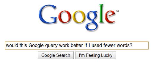
Here’s a study with an interesting finding: If you want to get better results on Google, try using a shorter query.
I found this while doing research for a story about automated “question answering” systems. I was reading through the work of James Allan, a computer scientist at the University of Massachusetts, and read his paper “A Case for Shorter Queries, and Helping Users Create Them” (PDF here). In it, he and his coauthor Giridhar Kumaran conducted an experiment: They took the query Define Argentine and British international relations and ran it through a search engine. (They don’t specify which one they used.) Then they ran various similar queries that used fewer words — “sub queries” — such as define britain international argentina or define britain relate argentina. Each time, he graded the relevance the search engine’s results, expressed as their “average precision” on a scale of zero to 1.0.
So which sub-query produced the best results? The shortest one. It was only two words long — britain argentina — but it scored 0.626, quite a lot better than the original, full-sentence query, which scored only 0.424.
Why would short queries work better than longer ones? Possibly because they contain fewer “noise terms” — common words like define or and — which might muddy the search results. Human language is filled with ambiguity; one of the big challenges for a machine is taking a human question and figuring out what, semantically, it’s actually asking. In that sense, using fewer words would reduce the number of potential ways the machine can misunderstand you.
Except the truly strange thing in that example above is the question was asking about British and Argentinian international relations — yet the best results came from removing the words “international” and “relations”. I’d have expected those to be important words, no? But that’s precisely the point Allan is getting at here:
Sub-queries a human would consider as an incomplete expression of information need sometimes performed better than the original query.
This suggests, of course, that the best way to get results on a search engine is to radically strip your query down even further than you think is useful. Or maybe start with a regular query, and if you don’t like the results, try making it shorter and shorter.
Then again, it’s hard to know if this would really work. I’m not privy to what’s going on behind the hood of most search engines today. Allan’s paper discusses several ways for question-answering systems to have the computer automatically shorten a query before feeding it into the knowledge database; but his paper is a few years old, so maybe these techniques are already common amongst search engines — maybe they already reformat our queries into semantically shorter formats.
What do you guys think? Anecdotally, have you found that super-short queries work better than longer, sentence-like ones?

Why do people eat unhealthy, high-calorie fast food? Is it because they don’t realize how bad it is for them — or do they realize it and just don’t care?
Two years ago, New York City bet it was the former. The city government passed a law requiring all fast-food chains to display the calorie count beside their food listings, right next to the prices. The theory was that if you forced people to see how many calories they were consuming, they’d make healthier picks. But did it work?
Apparently so. A group of Stanford University professors got Starbucks — one of the chains that began listing calorie counts — to give them the records for 100 million transactions at stores in New York, Boston and Philadelphia, over a 14 month period. Boston and Philadelphia do not have a similar law in place, so they were the control group. Sure enough, when the scientists compared consumption patterns at Starbucks in the three cities, New York’s law appeared to have had a small but significant impact: People made lower-calorie orders. As their paper — “Calorie Posting in Chain Restaurants” (PDF here) — concludes:
We find that mandatory calorie posting does influence consumer behavior at Starbucks, causing average calories per transaction to decrease by 6% (from 247 to 232 calories per transaction). The effects are long lasting: the calorie reduction in NYC persists for the entire period of our data, which extends 10 months after the calorie posting commenced.
Here’s what really intrigued me, though: At Starbucks, people behaved differently with food than with beverages.
When they calorie postings went up, customers quickly switched to lower-calorie Starbucks foods. But they didn’t switch to lower-calorie beverages. The scientists found calorie intake from food dropped by 14%, while the drop in calories for beverages was “negligible.” Indeed, the majority of the overall calorie reduction — that 6% drop — consisted of customers simply deciding not to order any food while at Starbucks. But when it came to drinks? They barely changed at all.
This is rather surprising, because some of those Starbucks drinks are insanely high-calorie. Say you order a Venti “Caramel Brulee Creme” with nonfat milk? That’s 480 calories, 70 of which are fat. Or how about a Venti “Double Chocolaty Chip Frappucino Blended Creme” with whipped creme? Friend, you just inhaled a whopping 670 calories, 200 of which were pure fat.
Given how fattening these drinks are — and, frankly, how nauseating they are; I have no idea how anyone can gag back these syrupy cocktails — why wouldn’t customers, when presented with the calorie count, pick something healthier? Some of these things are like pouring rendered tallow directly down your throat. (I’m actually not kidding: If you ate a half stick of butter you still wouldn’t come close to the calorie count of Venti “Pumpkin Spice Frappucino Blended Creme.”) Who drinks these revolting concoctions? I mean, “Mint Chocolaty Chip Frappuccino blended creme with Whipped Cream”? Even the whipped cream has to be chocolate-flavored? These customers do realize that there’s probably a corner store only a block away selling actual, regular, normal coffee for like 50 cents, right?
Okay, I’ll calm down now. The question is, why did the calorie information change the way Starbucks customers ate — but not stuff they drank? The researchers don’t speculate. But I think it’s because of the psychology of Starbucks itself. People who go to Starbucks are motivated primarily by the desire for a drink, not a piece of food. So even if they’re forced to confront the calorie count on their favorite, hideously repellent bucket of candied snot (sorry, I can’t stop myself here), they’re probably not going to change their mind. They’ll just decide to forgo the chocolate graham crackers.
Indeed, if you want further proof of this, consider another fascinating bit of data the scientists discovered: Starbucks customers actually overestimate the amount of calories in their favorite drinks. Before the enforced nutritional-posting law came into effect, the scientists polled Starbucks customers and asked them to guess how many calories were in their beverages. Amazingly, fully three-quarters of customers overestimated the amount. They thought the drinks contained 90 calories more than in reality. So that helps further explain why the labeling didn’t shift the customers’ drinking habits: They already knew the drinks were bad for them, and they didn’t care. Heck, some of them were probably relieved to discover they were drinking a mere 680 calories, instead of 770. Woo!
I should point out that the New York Times ran a story today that suggests the calorie-labeling law may prove to be a dud in the long run. Apparently the trend line for Starbucks customers went in a U-shape: After the law came into effect, their calorie intake dipped significantly, but then began creeping up again, and holiday binge-eating brought it entirely back up in line with Philadephia and Boston. Still, I have to say I’m impressed that New York managed to get a 6% reduction at all.
Maybe they should just hire me to stand outside various Starbucks locations and hector people. Yeah, that’d work.
(The photo above of that totally gross Peppermint Mocha Twist drink comes via stephenccwu’s Creative-Commons-Licensed Flickr photostream!)

James Pennebaker is a psychologist who specializes in analyzing how your use of seemingly innocuous words — like “I”, “we”, “he” or “she” — reflects your emotional state. He’s used his technique to study everything from the relationships of top Al-Qaeda members to the complexity of presidential candidates’ speech patterns. I first heard about his stuff because I tried out AnalyzeWords, a web app Pennebaker and his colleagues created that studies your recent tweets and deduces your “emotional style,” “social style” and “thinking style”. (Apparently, according to my recent tweets I’m “depressed”, “personable”, and “in-the-moment.”)
Anyway, I started reading through Pennebaker’s academic papers and hit upon this really fascinating one: The effect of testosterone on word usage.
Pennebaker knew that many studies have linked increased testosterone levels to aggression, negative moods, increased sex drive, and even things like improved
spatial skills and impaired verbal ability. So that got him wondering: Does higher testosterone affect how we use language?
To test this, he found two subjects who were undergoing testosterone-injection therapy: A 60-year-old man who was getting the injections to restore his upper-body strength, and a 28-year-old biological woman who three years into a transgender program to become a man. Pennebaker got writing samples — like email and journal entries — from the subjects before and after the injections.
The results? As Pennebaker wrote in a summary of the study:
Overall, testosterone had the effect of suppressing the participants’ use of non-I pronouns. That is, as testosterone levels dropped in the weeks after the hormone injections, the participants began making more references to other humans … One function of testosterone, then, may be to steer people’s interests away from other people as social beings.
On the one hand, that matches up with traditional claims about increased testosterone — that it makes you into a kind of gently sociopathic, type-A jerk. But the really interesting thing is that Pennebaker did not detect any other big changes in the subjects’ emotional states. “Contrary to commonly held beliefs,” he writes, “changes in testosterone levels were unrelated to linguistic markers of mood state, aggression, sexuality, achievement, and references to perceptual or cognitive processes.” So maybe some of the stereotypes about testosterone need to be revised.
Of course, it remains to be seen if Pennebaker’s findings hold up; with only two subjects, the results are very provisional. If you want to read his paper — “Testosterone as a Social Inhibitor: Two Case Studies of the Effect of
Testosterone Treatment on Language” — it’s online free here.
Can you convince people that something is good merely by telling them that other people like it?
This is the question, more or less, posed by Robert Merton in his famous essay on “The Self-Fulfilling Prophecy”. Merton thought it was indeed possible to convince people of a false proposition merely by telling them that lots of other folks believe it to be true. His canonical example was the bank run: If you start a whisper campaign saying that MegaBank is going to fail, then a few customers will start taking their money out, at which point other customers will begin to notice and take their money out, at which point it turns into a cascade and the bank really does fail. A self-fulfilling prophecy, as Merton put it, is thus “a false definition of the situation evoking a new behavior which makes the original false conception come true.”
These days, we wonder about self-fulfilling prophecies in pop culture. Since there’s no objective measure of quality in pop culture, theoretically it ought to be possible to intentionally cause self-fulfilling prophecies just by spreading disinformation and spin. Or can you?
Alas, it appears that sometimes you can. Duncan Watts, a pioneering network theorist, has done some incredibly cool experiments examining this question. I’ve been following his work for years — two years ago I profiled him for Fast Company, focusing on his critique of the idea of “influencers”. But this month Wired published my latest column, and it looks at Watt’s work on this question. The column is online here at Wired, and a copy is below. (And f you want to read Watts’ papers yourself, they’re online here (“Leading the Herd Astray” and “Web-Based Experiments for the Study of Collective Social Dynamics in Cultural Markets.”):
Sheepthink
Do self-fulfilling prophecies rule pop culture?
by Clive Thompson
Can you persuade someone to like a product by telling them that it’s popular? Do teenagers like Taylor Swift because she’s good or because everyone else they know likes her — so hey, she must be good, right?
Sociologist Robert Merton dubbed this tendency to base what we think we think on what other people are doing the “self-fulfilling prophecy” in 1949, and since then social scientists have tried to measure how powerful it actually is. Now, based on some studies conducted with the help of the Internet, it seems clear that we’re often just sheep.

For some time now, economists and psychologists have been learning a curious fact about money: The way that you’re paid — by the hour, or by an annual salary — affects your happiness a lot. In particular, if you’re paid by the hour, increases in pay are more likely to make you happy compared to people who are paid a salary.
Why would this be? One theory is that when you’re paid by the hour, you have a greater sense of the relationship between your time and your money. Increases in pay seem more significant, and each hour of work feels like money clinking into your piggy bank. (Or as one 2004 study of this stuff put it, being paid by the hour imbues you with “an accountant’s appreciation for the microeconomics of time.”) In contrast, people who are paid an annual wage don’t fine-slice their time that way, so they don’t “feel” money arriving with each hour of work.
But a recent experiment suggests it’s possible to make salaried employees feel more like hourly-waged ones. A pair of management professors took 164 people and divided them into two groups: The ones who were paid by the hour and the ones who were paid by a salary. As they suspected, the ones paid by salary didn’t index their happiness to their income as tightly as those hourly-waged ones did.
Then the professors did a mental “priming” exercise: They asked the annual-salary folks to take their annual salary, and calculate what it equals in hourly pay. After doing that bit of math, the professors repeated the psychological assessment and presto: The annual-salaried folks changed. They suddenly responded the same way as the hourly-paid ones, and income now similarly affected their sense of happiness.
The effect was only temporary; it ends when the priming wears off. But it suggests that if a company wanted its employees to respond to financial incentives more strongly, it should figure out some way to regularly prime them to think of the salaries in hourly terms. As the professors put it in their paper — “When is Happiness About How Much You Earn? The Effect of Hourly Payment on the Money-Happiness Connection” — published in the current issue of Personality and Social Psychology Bulletin:
… organizational practices that make the connection between time and money focal are likely to cause individuals to rely more heavily on income when assessing their subjective well-being.
The professors — Sanford E. DeVoe and Jeffrey Pfeffer — don’t suggest how a company could do this. Maybe have biweekly pay stubs break down employees’ salaries into hourly wages? Or some sort of desktop widget that shows “how much you’ve earned today?”
Of course, this could backfire spectacularly. I can just as easily imagine someone quitting after they realize how meager their salary looks when it’s broken into hourly increments. (Particularly when compared to the insanely huge hourly rates paid to outside consultants, lawyers, and the like.) Interestingly, there’s also evidence that when you think of your salary in hourly terms, you become more selfish. A 2007 study co-authored by Pfeffer (PDF copy here) found that people who are paid by the hour are more likely to “trade more of their leisure time to earn more money” — such as working on the weekends — and “less willing to volunteer their time and to actually spend less time volunteering.” That makes sense, of course: If you approach every waking hour with a mental taxi-meter clicking down how much cash you could have earned if you were working right at that moment, it’s probably harder to justify clocking an afternoon helping out at the soup kitchen.
On the converse, maybe you’re running a company where you pay people badly, so you want, cannily, to decouple the relationship between your employees’ pay and their sense of happiness. In that case, you’d want to pay them an annual salary and do everything you can to prevent them from thinking about how it nets out on an hourly basis. Then again, I can imagine that backfiring too. Being told you’re being paid $16,640 a year could be rather deflating, given that it’s only slightly above the poverty line for a two-person household. In comparison, being told “hey, we’re paying you $8 an hour!” — the equivalent rate — might seem kind of okay, given that this this exceeds the minimum wage in most American states.
(Yes, that’s right: The minimum wage in most states is pretty much near the national poverty line if you’ve got a spouse who doesn’t work, or you’re single parent with a kid. This isn’t a surprise — I’ve known this for years — but it always kind of freaks me out when I look at those figures.)
(BTW, that excellent photo of the wad of bills above comes courtesy AMagill’s Creative-Commons-licensed Flickr photoset!)
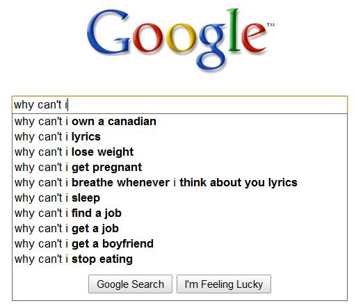
Back in November, I saw the incredibly excellent “Google Suggest” contest at Slate. You know about Google Suggest — it’s the little algorithm Google runs that observes what you’re typing in the search box, and suggests some possible things you might be searching for, based things similar things other people typed. Anyway, Michael Agger of Slate asked people to find the strangest things that Google suggests, and the winners were some real doozies.
I forgot about the contest until I was surfing the Tumblog of Alyssa Galella, and saw a funny post where she used Google Suggest to locate all the big stereotypes about Italians. So I started testing out some queries and found the one above.
And of course I’m all like, What the heck? “Why can’t I …” yields “Why can’t I own a Canadian?” So I clicked on the query and realized what’s going on. Apparently a popular meme online several years ago was a letter that someone wrote a satirical letter to radio host Laura Schlessinger after she told her audience that homosexuality is expressly forbid by Leviticus 18:22 in the Bible. The letter asks Schlessinger about whether other passages of Leviticus ought to be taken literally, including this one:
Lev. 25:44 states that I may indeed possess slaves, both male and female, provided they are purchased from neighboring nations. A friend of mine claims that this applies to Mexicans, but not Canadians. Can you clarify? Why can’t I own Canadians?
Heh. I’m a little surprised that this meme has so much Google juice that it has risen to the top of other “Why can’t I …” search strings.
While I was at it, I ran a few other Google Suggest queries and found some other surreal ones; they’re below, after the jump.

Is it ethical to eat plants? The argument against using animals for food has been gaining a lot of ground these days; veganism is becoming way more prominent, and there have been several bestselling books making the case against eating meat. But a few months ago I started wondering about about plants, and whether the logic could be extended to them.
The idea seems absurd on the surface. Anti-meat advocates point out that animals are conscious, have agency, and often have astonishingly high levels of awareness, intelligence and society. (Grey parrots and pigs are extremely smart; octopuses are almost alarmingly so.) But surely the same can’t be said of plants, can it?
Apparently it can. In a recent story in the New York Times, Natalie Angier — a science writer and (self-admittedly) irregular vegetarian — makes the case that plants “no more aspire to being stir-fried in a wok than a hog aspires to being peppercorn-studded in my Christmas clay pot … Plants are lively and seek to keep it that way.”
The most fascinating part for me was Angier’s description of the way plants recognize they’re being eaten, and fight back by calling for help:
Just because we humans can’t hear them doesn’t mean plants don’t howl. Some of the compounds that plants generate in response to insect mastication — their feedback, you might say — are volatile chemicals that serve as cries for help. Such airborne alarm calls have been shown to attract both large predatory insects like dragon flies, which delight in caterpillar meat, and tiny parasitic insects, which can infect a caterpillar and destroy it from within. [snip]… certain plants can sense when insect eggs have been deposited on their leaves and will act immediately to rid themselves of the incubating menace. They may sprout carpets of tumorlike neoplasms to knock the eggs off, or secrete ovicides to kill them, or sound the S O S. Reporting in The Proceedings of the National Academy of Sciences, Dr. Hilker and her coworkers determined that when a female cabbage butterfly lays her eggs on a brussels sprout plant and attaches her treasures to the leaves with tiny dabs of glue, the vigilant vegetable detects the presence of a simple additive in the glue, benzyl cyanide. Cued by the additive, the plant swiftly alters the chemistry of its leaf surface to beckon female parasitic wasps. Spying the anchored bounty, the female wasps in turn inject their eggs inside, the gestating wasps feed on the gestating butterflies, and the plant’s problem is solved.
You could counterargue, of course, that the plants aren’t actually conscious or self-aware. But you could make the same argument about some animals. And of course, we have legal arguments all the time about the pulling the plug on mentally incapacitated humans. (Granted, we’re not pulling the plug on them for the purposes of farming and eating them, but some of the philosphical nut is there.) The point is, we’ve always drawn a very clear line between animals and plants; Angier thinks it ought to be much blurrier.
The funny thing is, in practice we do have many situations where people ascribe a lot of agency to plants, and get enormously upset when those plants come to harm. Trees are a good example: There are laws in many townships prohibiting you from cutting down older trees, and I’ve seen people weep when a favorite tree is felled by a storm. You can’t judge the moral status of a being based merely on whether its demise upsets somebody — but the emotions stirred here are interesting and suggestive, to say the least.
By the way, the comment thread for Angier’s article is sprawling and super interesting too.
(The picture of the brussels-sprout plant above is courtesy arnold | inuyaki’s Creative-Commons-licensed Flickr photostream!)

The world of desktop-computer design has come a long way. Back in the 90s, we moaned about how all desktops were these horrible beige boxes — but pretty soon the iMac and the casemodding community shoved the needle forward on computer aesthetics, such that there are now a lot of reasonably pretty computers you can buy to bring some semblance of joy to your airless cubicle.
But still — man, the “Philco PC” is in a class by itself. The SchultzeWORKS design firm released this concept online last month, and it’s so insanely gorgeous that blogs and media and Twitterers went faintly mad for it. I’m coming to this one pretty late, but I can’t resist. I’m a total sucker for this sort of retro-futurist design, particularly when it actually seems highly functional.
To wit: That case is comparatively quite big, which is a good thing; too many high-concept desktop comptuers aim at wafer-thin teensiness, which require overly expensive custom components. In contrast, the Philco could probably be built with inexpensive off-the-shelf electronics. Also, that box would likely be easy to open up and install new components, so you could upgrade the machine as it ages — allowing for greater value and less environmental waste. The side venting suggests fairly cool running without super-loud fan noise, and the manual-typewriter-style keyboard could be wonderfully tactic and ergonomically clicky if engineered correctly.
Could somebody please, please bring this thing to market? Apparently I’m not alone, because SchultzeWORKS was forced to put this clarification on its press release:
Thank you to everyone who has called or written to inquire where they could buy the Philco PC. However, these images are 3D renderings of a design concept which does not yet exist in the real world. We are currently meeting with PC manufacturers and hope that will change in the near future. In the meantime, thanks for the interest, and it’s very cool that you thought the images were real.
Check out the press release for additional gorgeous, droolworthy pictures.
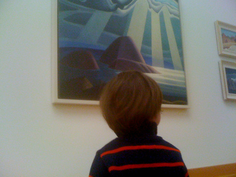
I wasn’t supposed to take this picture.
Here’s the backdrop: Last week I was in Toronto for the holidays, visiting family and friends, and I decided to take my four-year-old son Gabriel and two-year-old son Zev to the Art Gallery of Ontario to see works by the Group of Seven. Zev was pretty entranced by the Lawren Harris paintings — that’s him above, checking out one of Harris’ works. (I didn’t note the name of that painting; does anyone know?)
Though I’ve always enjoyed the Group of Seven’s work, I hadn’t actually been face-to-face with any of the paintings for ten years or so. I had forgotten how totally awesome they remain, decades after their work ceased being revolutionary or “new”. When I was a kid, my favorite was Harris, because his Arctic paintings — all the icebergs and snowy mountains — were so straightforwardly iconic and ethereal, almost comic-booky. But I never really appreciated the way Harris put traditional Judeo-Christian iconography into a blender with First-Nations artistic traditions.
I also found myself completely absorbed in the other Group of Seven members I hadn’t paid much attention to before, like Franklin Carmichael. Interestingly, I think this is because I’d been admiring the recent “fauxvist” video-game paintings of my friend James Barnett. And Carmichael himself — like most of the Group of Seven — was also inspired by the fauvists, to the point where Carmichael’s “Autumn in the Northland” looks a lot like Jamie’s paintings, and vice versa. (If you haven’t read my blog post about Jamie’s video-game paintings, go see it now so the rest of this blog post will make sense.) When I first saw Jamie’s paintings back last summer, I went online and read a bunch of art criticism about the fauvists, because I was intrigued by how Jamie was using their technique to do create video-game landscape art. By the time I hit the Art Gallery of Ontario two weeks ago, I was much more able to appreciate Carmichael’s work, since he was doing the same thing a hundred years ago — using fauvist techniques to re-see the Canadian wilderness. This whole process became a most excellent cultural-feedback loop: The fauvists inspire Jamie, who does paintings of video games in that style, which gets me interested in the fauvists, which allows me to re-appreciate the revolutions in Canadian art that were triggered a century ago during the actual time of the fauvists.
It reminded me of a point often made by folks who fight overly-aggressive copyright laws: All new art is based on art that came before, so copyright law ought not to be too rigid. If you can’t remix and resample and re-use art — after a reasonable term of exclusivity for the original creators, who in this case are long dead — then culture dies. More subtly yet, our appreciation for earlier art dies if our contemporary artists cannot easily plunder the styles and content of their forebears.
The irony here is that the instant after I snapped this picture, the security guards of the Art Gallery of Ontario raced over to (politely) warn me that I wasn’t allowed to take pictures. Why? Well, some art galleries disallow photos because flashes can damage paintings, a prohibition that makes total sense. But my iPhone doesn’t have a flash. No, the Art Gallery of Ontario prohibits photographs of artwork because of copyright restrictions. The AGO folks don’t sound very happy about this (“We didn’t set the copyright rules but we are required to respect them,” as they point out on their site). It’s even more daft when you consider that I’m basically doing free promotion here.You want people to visit galleries? Well, surely one good way is to let visitors take and post photos of their little kids spellbound by major works of art.
Ah well. My line of logic here is, I admit, rather loose and rambling. Jamie’s video-game paintings do not actually impinge on any copyright from earlier paintings; they’re using the style of a former generation of artists, not their specific content. Still, the whole thing made me think a lot about the way art builds on art — and how copyright law can actually get in the way of art appreciation.

A couple of weeks ago the New York Times Magazine published its annual “Year In Ideas” issue, for which I wrote five entries. The one I’ve gotten the most email about is “Zombie-Attack Science” — which reports on a group of Ottawa scientists who created a computer model of what would happen if the zombies really invaded. The story is online here at the Magazine’s site, and the full text is below. (And if you want to read the paper yourself, it’s here!)
Epidemiologists today worry a lot about swine flu. But earlier this year, Philip Munz got interested in a more devastating possibility: an outbreak of zombies. A graduate student at Carleton University in Ottawa, he was watching a lot of movies about the undead and realized that zombification could be regarded as a classic paradigm of infectious spread: people get bitten by zombies, after which they turn into zombies themselves and start biting others. So Munz decided to use the tools of epidemiology to answer a sobering public-health question: could humanity survive a zombie outbreak?
Working with a professor and two other graduate students, Munz built a mathematical model of a city of one million residents, in which an outbreak occurs when a single zombie arrives in town. He based the speed of zombie infection on the general rules you see in George Romero movies: after getting bitten, people turn into zombies in 24 hours and sometimes don’t realize what’s happening to them until they change.
When he ran the model on a computer, the results were bleak. “After 7 to 10 days, everyone was dead or undead,” he says. He tried several counterattacks. Quarantining the zombies didn’t work; it only bought a few extra days of survival for humanity. Even creating a “cure” for zombification led to a grim result. It was possible to save 10 to 15 percent of the population, but everyone else was a zombie. (The cure in his model wasn’t permanent; the cured could be rebitten and rezombified.)
There was only one winning solution: fighting back quickly and fiercely. If, after the first zombies emerge, humanity begins a policy of “eradication,” then the zombies can be beaten. This is, as Munz points out, what traditionally saves humanity in zombie flicks. “People finally realize what’s happened,” he says, “and they call the army in.” Or as he concludes in his paper on the work, to be published in the collection Infectious Disease Modelling Research Progress: “The most effective way to contain the rise of the undead is to hit hard and hit often.”
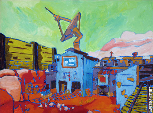
In a few months I’m moving to a new and bigger place, and one of the best things is that I’ll finally have space to hang a new painting I bought: Goldrush, by my artist friend James Barnett. It’s part of an incredibly cool series he’s been doing: Oil paintings of scenes from video games. The piece above is called Goldrush, and the scene? It’s from Team Fortress 2.
Jamie has been doing this stuff for a while; I mentioned him in a Wired piece I wrote a year and half ago about the new generation of artists who are producing work inspired by, or meditating upon, video games. Back then he was doing work mostly from Half Life, but his latest group of paintings come from a whole array of recent games. You can see the entire series at his site here. They’re done in the lush, gobs-o-color style of the early-20th-century fauvists; Jamie calls his approach “fauxvism”, heh.
When I first saw these paintings I also was struck by their similarity to the work of the Group of Seven, a collection of modern artists who revolutionized Canadian painting in the early 20th century. The Group of Seven scandalized the staid Canadian art establishment by taking the emerging principles of modern art and applying them to the wilderness of Northern Ontario. Up until then, most Canadian art (and there wasn’t much of it) had been realist; the Group of Seven essentially crafted a new way to visualize the natural world that had become numbingly familiar to Canadians.
What I love about Jamie’s work is that it has the same sort of relationship to realism in video games. Most big-budget 3D action games these days strive after straightforward photorealism; by reinterpreting that realism fauvistically (that is probably not a word, but hey), Jamie’s paintings give you a way of re-experiencing game worlds the same way the Group of Seven’s work let early Canadians re-see the world around them. Given how much time gamers spend inside “realistic” virtual worlds, games constitute our new mental landscapes. As Jamie puts it a good Q&A interview online at NewsPlink:
Q: The video games provide you with the scenes? A: Yes, but they aren’t simple screenshots from reviews or websites. I walked around within each game until I saw a view worth taking a picture of (unfortunately, there are no “Scenic Viewpoint” signs in games). I positioned myself to create the composition from within the game, and that’s what I used as a basis for the painting.
Q: How long does the process take you? And what do you use?
A: Each one takes about 5 to 25 hours depending on size, not counting the time spent in-game stalking the elusive perfect composition. They’re all oil on wood panel.Q: Some of them seem true-to-life in that they are recognizable. Does that mean we’ve come a long way from Pac-Man?
A: We have, but I get frustrated by three-dimensional games that slavishly imitate real life. You have teams of artists and designers; why just imitate normal old reality? Come ON, people! Do something weird! Games like Braid have expanded that boundary by introducing painterly artwork. Fortunately, even some 3D games have started to move away from representational rendering into more fanciful and interesting styles.
The funny thing about Goldrush is that I haven’t actually played Team Fortress 2 yet myself, so I’m not re-experiencing the game when I look at the painting. Then again, I’m not re-experiencing the specific location in Algonquin Park when I look at Tom Thomson’s The West Wind, because I’ve never visited that spot either. I do look forward to finally playing Team Fortress 2 and visiting that radio telescope, though!
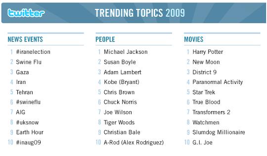
Why are the “trending topics” on Twitter so frequently dull?
When Twitter first began running trending topics, I was kind of excited. I loved the idea that we could spot emerging areas of interest in the overmind, and get intriguing insights into what Americans, and people the world over, were thinking about.
Alas, that’s not quite the way it has worked out. Twitter recently published its Top Twitter Trends of 2009; they’re excerpted above, and as you can see, the overmind has apparently been obsessing over the swine flu, Iran, Michael Jackson and Tiger Woods. Of course, these subjects are all screamingly obvious, each having been long ago chewed into a tasteless cud by the 24-hour news cycle.
Did we really need a mathematically-ranked, up-to-the-minute amalgamation of the utterances of millions of everyday citizens to give us this snapshot of our collective attention span? Chris Brown, Paranormal Activity, Snow Leopard, Kobe Bryant … man, you could have predicted those topics by lazily wandering down to your local newsstand like once a month and noting the boldface names on the magazines. The overmind appears to be spending a lot of time ZOMGing over the same stuff as the undermind, as it were.
The problem here is the problem with all mainstream, middle-of-the-road subjects: They’re not going to be surprising, and information that isn’t surprising often isn’t useful or interesting either. (The way I see it, mainstream topics mostly useful in social bonding: Heavily-trod subject matter is great when you need to make pleasant chatter with strangers. “Crazy weather we’re having, eh?”) It’s not that the concept of “trending topics” is itself useless. It’s that sampling the entire population of Twitter is often pointless, because it’s too broad.
So what would be more intriguing? I think you’d get cooler trends by sampling the Twitter flow of a smaller, more cohesive group of people — like your friends, your co-workers, or even a collection of strangers in which you’re interested. In that case, the trending subjects are possibly going to be more eclectic and unexpected. I wasn’t sure whether there were any Twitter tools that actually did this, so I posed the question on — where else? — Twitter, whereupon @johntunger suggested FlockingMe.
FlockingMe is a simple web app: You select a subgroup of people you follow on Twitter, and it shows you all their latest tweets … with a list of trending topics at the top. As of five minutes ago, here were the hot topics amongst the group of 30 Twitter friends I picked:
venturebeat’s list
things
damn
discovered
struggling
passed
gets
building
snark
chocolate
Which is quite a bit different from the topics currently trending on Twitter overall, which were thus:
#whoremembers
#nowplaying
Whore Members
#Imfrom
Happy Palindrome Day
Avatar
RT if
#in2010
UFC 108
Nick’s
As you can see, the results from FlockingMe were sometimes useless because they didn’t filter out overly common words, like “gets”. The overall Twitter trending topics contained far more hashtags — including some really funny ones, like Whore Members (I thought I was the only one who was misreading the nostalgic #whoremembers tag!) — because when you’re looking for common word-usage amongst millions of folks, hashtags are more likely to be a common occurrence than amongst a small group of 30 people. On the other hand, the tags from my small group were so suggestively strange I clicked on a few to figure out what the hell was going on. (“Struggling” came from a Tweet about an Onion story and a tweet about the Washington Post; “chocolate” was … well, a lot of people I know are binging on chocolate right now.)
So the experiment was only partially successful. I suspect that FlockingMe would produce better results if I seeded it with larger groups that had a greater internal focus (and if FlockingMe tweaked their algorithm a bit). But I still think this concept has a lot of promise.
By the way, FlockingMe apparently isn’t the only app that does this. Several of my Twitter followers suggested other tools: @jelefant and @taylordobbs said Tweetdeck can show you the trending topics for a specific group, which sounds great except that I don’t like using a Twitter desktop client. (I’m too lazy, and I bounce between four different computers weekly.) @kevinmarks and @pistacio suggested TuneIn, but when I tried it out I couldn’t figure out where exactly the trending topics were on the page. (Was I doing something wrong?) And @digiphile pointed me to TwitterTim.es, which shows you any links that your Twitter posse are passing around (It worked well, but was too complex for my tastes: All I want is a simple, clean, text list of trending topics). Thanks to everyone for responding so quickly!

If you’ve been diligently following your giant-squid news, you probably heard two weeks ago about the invasion of Humboldt squid in the ever-warming waters off California. Now, Humboldt squid have a lethal reputation. South American anglers have long spoken in dread whispers of the ferocity of the six-foot-long Dosidicus gigas, spinning Cthulhuian tales of fisherman dragged screaming into the briny deep by forearm-thick tentacles, whereupon they are messily devoured by the Diablo Rojo’s fleshreaping beak.
This centuries-old mythos was given new life in the 90s, when Steve Cassell, a diver and adventurer, began swimming with the Humboldt Squid and penning hair-raising tales of how they viciously attacked him. It’s pretty nutty stuff: Among other things, Cassell reports being hit with “a tentacular strike that felt like being hit with a baseball bat square in the ribs”, and a profile of Cassell in Outside magazine describes the squid “bull-rushing him with a flare of arms and tentacles followed by the scrape of sucker teeth on his armor.” Yes, armor: The dude has custom-built some sort of padded gladiatorial outfit to survive the Humboldt’s fury.
Ah, but now another scientist claims this is all false, malicious libel. Brad Seibel, a biologist at the University of Rhode Island, has been studying the Humboldt squid for years now, because he’s trying to figure out how they survive at 300-meter deep levels, where oxygen is scarce. Seibel says the squid are actually totally “timid” and “nonthreatening”; after getting annoyed at the recent hooplah about the red devils, Seibelput out a press release describing his own dives:
Scuba diving at night in the surface waters of the Gulf of California in 2007, Seibel scanned the depths with his flashlight and saw the shadows of Humboldt squid far in the distance. After he got up his nerve, he turned off the light. When he turned it back on again 30 seconds later, he was surrounded by what seemed like hundreds of the squid, many just five or six feet away from him. Most were in the 3-4 foot size range, while larger ones were sometimes visible in deeper waters. But the light appeared to frighten them, and they immediately dashed off to the periphery. [snip]
Seibel was surprised by the large number of squid he encountered, which made it easy to imagine how they could be potentially dangerous to anything swimming with them. Their large numbers also made Seibel somewhat pleased that they appeared frightened of his dive light. Yet he said the animals were also curious about other lights, like reflections off his metal equipment or a glow-in-the-dark tool that one squid briefly attacked.
“Based on the stories I had heard, I was expecting them to be very aggressive, so I was surprised at how timid they were. As soon as we turned on the lights, they were gone,” he said. “I didn’t get the sense that they saw the entire diver as a food item, but they were definitely going after pieces of our equipment.”
Heh. Personally, I’m not sure I’d dive with cephalopods that were trying to eat my metal equipment, but it’s pretty cool hearing an alternative view on Humboldt squid.
(The picture above is from the Outside piece, which is quite awesome and worth reading.)
I'm Clive Thompson, the author of Smarter Than You Think: How Technology is Changing Our Minds for the Better (Penguin Press). You can order the book now at Amazon, Barnes and Noble, Powells, Indiebound, or through your local bookstore! I'm also a contributing writer for the New York Times Magazine and a columnist for Wired magazine. Email is here or ping me via the antiquated form of AOL IM (pomeranian99).
ECHO
Erik Weissengruber
Vespaboy
Terri Senft
Tom Igoe
El Rey Del Art
Morgan Noel
Maura Johnston
Cori Eckert
Heather Gold
Andrew Hearst
Chris Allbritton
Bret Dawson
Michele Tepper
Sharyn November
Gail Jaitin
Barnaby Marshall
Frankly, I'd Rather Not
The Shifted Librarian
Ryan Bigge
Nick Denton
Howard Sherman's Nuggets
Serial Deviant
Ellen McDermott
Jeff Liu
Marc Kelsey
Chris Shieh
Iron Monkey
Diversions
Rob Toole
Donut Rock City
Ross Judson
Idle Words
J-Walk Blog
The Antic Muse
Tribblescape
Little Things
Jeff Heer
Abstract Dynamics
Snark Market
Plastic Bag
Sensory Impact
Incoming Signals
MemeFirst
MemoryCard
Majikthise
Ludonauts
Boing Boing
Slashdot
Atrios
Smart Mobs
Plastic
Ludology.org
The Feature
Gizmodo
game girl
Mindjack
Techdirt Wireless News
Corante Gaming blog
Corante Social Software blog
ECHO
SciTech Daily
Arts and Letters Daily
Textually.org
BlogPulse
Robots.net
Alan Reiter's Wireless Data Weblog
Brad DeLong
Viral Marketing Blog
Gameblogs
Slashdot Games
