« PREVIOUS ENTRY
The art of the essay
NEXT ENTRY »
CNN cites Wikipedia
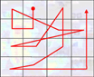
Have I got your attention now? The Eyetrack III project took a bunch of San Franciscans, plunked them down in front of various news web-sites, and tracked their eye movement — to find out what, precisely, we look at. That chart above tracks the most common results: People start in the upper left quadrant of the screen, zip to the right, then zigzag down before landing in the upper right corner.
Of course, what I immediately began wondering is — how does Collision Detection stack up? I’m no web designer; two years ago, I spent a weekend leafing through free templates at Blogskins and swiped my current look, which was created by Tyler Cole and is called “Carabeth Blue”. I liked it because it was simple, but as it turns out, it nicely cleaves to the standard viewing pattern of web surfers! After all, the lead entry in this blog each day appears precisely where the study says the average lands: Slightly to the right of the absolute upper left. Meanwhile, the “least valuable” space on the page — i.e. the very last place the eye tends to look — is the upper right corner, where I have … nothing but some white space and placer text.
It’s kind of eerie. Did I subconsciously intuit these principles when I picked my design? Or did I just luck out?
(Thanks to Boing Boing for this one!)
I'm Clive Thompson, the author of Smarter Than You Think: How Technology is Changing Our Minds for the Better (Penguin Press). You can order the book now at Amazon, Barnes and Noble, Powells, Indiebound, or through your local bookstore! I'm also a contributing writer for the New York Times Magazine and a columnist for Wired magazine. Email is here or ping me via the antiquated form of AOL IM (pomeranian99).
ECHO
Erik Weissengruber
Vespaboy
Terri Senft
Tom Igoe
El Rey Del Art
Morgan Noel
Maura Johnston
Cori Eckert
Heather Gold
Andrew Hearst
Chris Allbritton
Bret Dawson
Michele Tepper
Sharyn November
Gail Jaitin
Barnaby Marshall
Frankly, I'd Rather Not
The Shifted Librarian
Ryan Bigge
Nick Denton
Howard Sherman's Nuggets
Serial Deviant
Ellen McDermott
Jeff Liu
Marc Kelsey
Chris Shieh
Iron Monkey
Diversions
Rob Toole
Donut Rock City
Ross Judson
Idle Words
J-Walk Blog
The Antic Muse
Tribblescape
Little Things
Jeff Heer
Abstract Dynamics
Snark Market
Plastic Bag
Sensory Impact
Incoming Signals
MemeFirst
MemoryCard
Majikthise
Ludonauts
Boing Boing
Slashdot
Atrios
Smart Mobs
Plastic
Ludology.org
The Feature
Gizmodo
game girl
Mindjack
Techdirt Wireless News
Corante Gaming blog
Corante Social Software blog
ECHO
SciTech Daily
Arts and Letters Daily
Textually.org
BlogPulse
Robots.net
Alan Reiter's Wireless Data Weblog
Brad DeLong
Viral Marketing Blog
Gameblogs
Slashdot Games
