« PREVIOUS ENTRY
Misophonia, or, why my leg-tapping drives some people nuts
Some sad news: Michael Hart, the founder of Project Gutenberg, passed away this week. If you read any ebooks at all, you can thank Hart: He basically invented them. In 1971 he typed the text of the US Declaration of Independence into a University of Illinois computer so that it could be passed on, freely and ad infinitum, to other readers. Then he decided that’s how all books should be made available: Digitally, instantly, and globally. He founded Project Gutenberg and began scanning or typing in public-domain works; as of this month the project has a capacious catalogue of 36,000 free books. (The New York Times published an obituary today, and there’s a nice commemoration here too.) This was crazy-awesome visionary stuff.
I use Project Gutenberg a lot, often in weirdly opportunistic ways. I’ll be walking down the street and suddenly remember an old book I read or looked at years ago, like Aristophanes’ The Clouds, or the gothic Canadian/British/Algonquin horror story The Wendigo. Then I’ll pull out my phone, launch the free ereader Stanza, download the book from Project Gutenberg, and start reading it — a process that takes 30 seconds. I’ve got about three dozen ebooks on the phone right now that I’m currently poking through. Every single time I use the service I think, man alive, this is how books should be: Instantly available for free. (Once they’re out of copyright, of course. Which ought to happen 14 years after publication, as Congress originally intended, instead of the current until-the-sun-explodes-or-we-run-out-of-lawyers madness … but I digress.) So basically I love Project Gutenberg to death.
Except for one thing: The books are almost totally unformatted.
Project Gutenberg’s are basically just plaintext. Hart understandably didn’t want to get swept up in the format/DRM wars between different vendors, precisely the sort that currently prevent you from moving a Nook book over to your Kindle or vice versa. It’s not that Project Gutenberg does no formatting; they hyperlink footnotes, make it easier to zip back and forth a bit. But other than that, the only formatting you get is whatever’s baked into your ereader software itself.
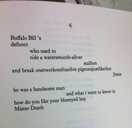
Which is capable and functional but … kinda bland. There’s no aesthetic joy in cracking open a Project Gutenberg title; it’s just you and the words. I can tolerate this, more or less, with novels and nonfiction. But the lack of formatting means Gutenberg’s poetry collections are often seriously deformed: The lines don’t break correctly, the spacings and indentations in modern poetry aren’t there; sometimes stanzas don’t even have the proper space between them. Ereaders like Stanza and Kindle enworsen (not a word, but should be) this situation, because they’re not designed to recognize and handle poetry. If a line is, say, too long to display in a single row of text, they wrap it around but don’t indent it, effectively destroying the line breaks the poet intended.
So while I’m a huge consumer of poetry, I’ve given up trying to read it using Project Gutenberg files. When it comes to poetry — particularly modern poetry — typography and layout aren’t just a fillip: They’re a core part of how the poem makes its meaning. That poem by e. e. cummings I put above? Imagine that turned into unformatted plain text, all the nuanced spacings turned into, I dunno, willy-nilly tab-separated chunks, and you get the picture. (BTW, I’ve found drama suffers from the same problem sometimes, too — particularly verse drama.)
I thought it was just me being a crank about this stuff. But as it turns out, I’m not alone. While reading some of Hart’s own essays this morning, I was intrigued to discover that people frequently complained to him — heatedly — about the absence of formatting. As he writes:
The thing I perhaps like least about eBooks is how many people in the world think it is my job to make eBooks come out exactly that way they think is the best in the world, and constantly harass me to change to this format or that one as the only, or primary, one of all the formats in the world.
Sorry, CONTENT is what Project Gutenberg provides but not FORMAT, FORM, FORMALITY, etc.
Let’s face it, but when even the plainest of plain text eBooks is created, 99% of the work of re-creating it into another format is already done, all YOU have to do is change 1% and you can have it any other way you want it. On top of this, there are many format conversion programs out there that will do most of this for you.
It’s funny how something that has already done 99% of the labor’s time and effort can be so vilified for not doing the other 1%.
Two things are interesting here. First, he’s quite right that I could change the 1% of the text to make a Gutenberg file more beautiful. And second, I’m probably not going to do it. I’ll either tolerate it or pay some money to somebody who can make it prettier for me.
And that, it occurs to me, presents some interesting possibilities for the ecosystem — and economics — of ereader software.
There’s a mountain of public-domain works out there, and while they can all be gotten for free via Stanza and Kindle and Nook, they all look like crap. They’re missing illustrations, frontispieces … anything to make their reading lush and lovely. True, Google’s mobile ereader offers old-school books in their original typography, but the viscissitudes of scanning and age mean they’re often less than legible, particularly on weensy screens.
Why doesn’t someone hoover up old, out-of-print books from Project Gutenberg and create ereaders that deliver the text using lovely, to-die-for aesthetics? Or to-die-for intellectual add-ons — as with Bob Stein’s prediction that we’ll one day have a class of marginalia-writers so good you’ll pay to have their notes and commentary appear in your digital copy of a book. Seriously, I’d pay for that.
Now, one could point out that this problem of aesthetics isn’t limited to Project Gutenberg books. At the moment, the great mass of commercial ebooks — i.e. the contemporary books you buy via the Kindle, Nook, Sony and Apple ebooks — are all super bland. But there’s nothing a third-party designer can do about that problem, because most of what’s being read on Kindles, Nooks etc is modern, copyrighted stuff. You can’t legally suck the text out and plunk in into a designed environment that makes it look more lovely. The out-of-copyright works in Project Gutenberg, in contrast, are a rich field that smart designers could plough, and likely a profitable field too. Indeed, print publishers have long made plenty of dough off of out-of-print works: They’re constantly bringing out new editions of classic old novels, and enticing buyers with gorgeous paper or cover design or an intro written by somebody famous.
Indeed, I can already spy experiments like this emerging in the ereader world. In a hunt to find any sort of vaguely-aesthetically-pleasing poetry viewer for the Iphone, I happened upon Poem Flow. It’s a very cool app: It displays poems line by line, fading in and out of view. You can control the rate at which the lines flow (I prefer ‘em pretty fast), and if you want, view the whole poem as one static page. And it’s a freemium model: While it comes with 20 poems installed, if you want more it’s 99 cents for three months of daily updates, or $2.99 for a year. I paid up.
People may not pay for out-of-print text, but they’ll pay for awesome aesthetics.
(By the way, I don’t intend this discussion as a criticism of Hart’s remarkable work. I don’t think Project Gutenberg should be formatting texts; it’s something best left to other folks, and indeed in that interview Hart talks about how Project Gutenberg actively works with people who want to do that 1% of the formatting to transform a free work. What interests me here is how Project Gutenberg’s work has opened up a potentially cool new area of ebook design … should any designers pick up the challenge.)
I'm Clive Thompson, the author of Smarter Than You Think: How Technology is Changing Our Minds for the Better (Penguin Press). You can order the book now at Amazon, Barnes and Noble, Powells, Indiebound, or through your local bookstore! I'm also a contributing writer for the New York Times Magazine and a columnist for Wired magazine. Email is here or ping me via the antiquated form of AOL IM (pomeranian99).
ECHO
Erik Weissengruber
Vespaboy
Terri Senft
Tom Igoe
El Rey Del Art
Morgan Noel
Maura Johnston
Cori Eckert
Heather Gold
Andrew Hearst
Chris Allbritton
Bret Dawson
Michele Tepper
Sharyn November
Gail Jaitin
Barnaby Marshall
Frankly, I'd Rather Not
The Shifted Librarian
Ryan Bigge
Nick Denton
Howard Sherman's Nuggets
Serial Deviant
Ellen McDermott
Jeff Liu
Marc Kelsey
Chris Shieh
Iron Monkey
Diversions
Rob Toole
Donut Rock City
Ross Judson
Idle Words
J-Walk Blog
The Antic Muse
Tribblescape
Little Things
Jeff Heer
Abstract Dynamics
Snark Market
Plastic Bag
Sensory Impact
Incoming Signals
MemeFirst
MemoryCard
Majikthise
Ludonauts
Boing Boing
Slashdot
Atrios
Smart Mobs
Plastic
Ludology.org
The Feature
Gizmodo
game girl
Mindjack
Techdirt Wireless News
Corante Gaming blog
Corante Social Software blog
ECHO
SciTech Daily
Arts and Letters Daily
Textually.org
BlogPulse
Robots.net
Alan Reiter's Wireless Data Weblog
Brad DeLong
Viral Marketing Blog
Gameblogs
Slashdot Games
