This is just a short note to say that yesterday I arrived in Italy for my two-week honeymoon, so I’ll probably not be posting until Dec. 13 when I get back.
The design of games — the design of play, really — is one of the most ill-understood and philosophically neglected topics in modern society. Most adults know how a movie is made or how a TV show is made, and many know how an album is recorded. But no-one has any idea how a game is created. They just arrive like black boxes in our Playstations or on our living-room tables. Yet the design of play is an incredibly subtle mix of an enormous number of fields, including psychology, philosophy, sociology, graphic design and engineering.
As many smart game designers have told me, one of the best ways to understand the challenges of making a good game is to study board-game design. That’s why I was thrilled to get a chance to write a piece for yesterday’s New York Times Magazine about today’s designers of children’s board games. I mostly focused on Cranium, though I also got a chance to look at Out of Box Games too. You can read the whole story online here, but here’s a taste. In this excerpt, I’m talking about the creation of Balloon Lagoon, one of Cranium’s games for preschoolers:
The designers developed four activities that touched on children’s different intelligences — like the frog flipping, a test of dexterity, or spelling with the letters fished out of the word pond, a linguistic challenge. Each player had 30 seconds to try each activity, to maximize the chance that every child would win — ”shine” — at least once. They set up a sand timer to count down the 30 seconds.
But the timer caused unexpected friction, as Alexander recalls: ”One kid would take on the self-appointed task of being the sand-time watcher. And they’d be sitting there tapping the timer and going: ‘Time’s almost up! Time’s almost up!’ The trash-talking would start as soon as the timer went on.” He watched kids sassing one another in a play-test one day and came out shaking his head. ”I said to the team, ‘Well, we’ve done a great job of making the Your Time Is Almost Up game.”’
Then a designer had a breakthrough idea. If the timekeeping was the problem, he reasoned, then they had to ”hide the time” — by making the timekeeping invisible. They got rid of the sand timer and replaced it with a music box that plays a tune for 30 seconds, like musical chairs. Each child would play until the song ends and then stop. It was a neat bit of social engineering: with no clock to watch, the kids shifted allegiance and began rooting for each player as he or she vied to complete the task in 30 seconds. ”It transformed it from this schoolmarmish situation to one where they’re all cheering each other on,” Alexander says, ”and high-fiving.”

First, we had the problem of people driving while talking on their mobile phones — and distractedly mowing down old ladies like dry grass. So we figured out a solution: Laws that demanded people use hands-free headsets or voice-activated phone dialers.
But as it turns out, not only does this new tech not improve the situation, it might actually make it worse. A recent study by the National Highway Traffic Safety Administration found that people who use hands-free phones are just as likely to plough through grandma and her walker as those who hold the phone in their hands. Indeed, people using hands-free tech made errors in dialing 40 per cent of the time, compared to only 18 per cent of the time when they held the phone; and of course, the more frustrated they are, the more dangerous they are.
As the New York Times reports:
The study concluded that in most cases, drivers “overestimated the ease of use afforded by hands-free phone interfaces.”
Drivers can be easily distracted, even when they have both hands on the wheel. “In many cases, it’s the amount of brain power you’re using,” said David Champion, the senior director of auto tests for Consumer Reports. “Even if you’re using a hands-free phone, you’re using quite a bit of brain power to actually have a discussion.”
Actually, I think they’re doing the wrong research. I don’t think we’ll learn much by comparing the distraction levels of hands-free drivers versus phone-holding ones. Here’s a more interesting research idea: Compare the distraction levels of drivers who are talking on a mobile phone, versus drivers who are talking to someone else in the car.
Why? Because this would clarify what’s really at stake here: The physical context of the person you’re speaking to.
What I mean is this: If I’m driving a car and you’re riding shotgun, we can carry on a conversation, but you’re present in the situation. So if something dangerous is about to happen, you can react. Indeed, since you’re a second pair of eyes, you can actually help me avoid danger — by noticing if I’m driving too fast, or about to rear-end someone because I’m looking off to the side. And since you’re riding in the car, your safety is at risk the same as mine is, so you’ve got a powerful incentive, however subconscious, to monitor the situation and make sure I’m driving reasonably well. Even if the conversation is distracting me, I get some benefit from the person I’m talking to being physically there.
But if I’m talking to you on the phone, I get all the distraction — with none of the help driving. Worse, the conversation is asymmetrical: Whereas I might be only half paying attention because I’m driving, you’re fully engaged in the conversation, and that emotional center of gravity drags me even further away from where I am, which is in a car. In a sense, your physical environment — sitting at home, in a bathtub, in a bar, wherever — infects my environment. That’s why I’d be interested to see data comparing driving quality between a driver who’s talking to a passenger, and a driver who’s talking to someone on the phone.
I suspect we’d find that a driver talking to a passenger performs better. And that would suggest something really cool: That we could make a phone conversation safer by making it more like an in-car conversation.
We could, for example, try to immerse the conversational partner in the driver’s situation — to use telepresence technology to let them virtually “be” in the car. For example, you could be sitting at home talking on the phone to me while I drive, and looking at a screen that shows you a 360-degree view out the windows of my car. You’d be pulled into my situation. And that would probably make you a safer person to have a conversation with. You might well pick up on some dangerous stuff that I’m not seeing.
Of course, this might not work at all. If someone experiences my car ride solely through a screen, it might seem like a video game, and they might actively downplay dangerous driving situations I’m in, because it all seems so unreal.
Either way, the point remains the same. Whenever we talk about how to make a driving conversation safer, all we talk about is modifying the behavior of the person driving. Why not try to modify the behavior of the person on the other end of the line?

This is insanely brilliant. AOL recently began running a series of insanely smug commercials: In one, they portray their company heads as sagely anticipating everything their customers want; in another, their customers show up to offer “some ideas to make the Internet better.” (That latter one is stupidly galling — since it’s another example of how AOL likes to keep its already clueless customers even more so, by misinforming them about what precisely the Internet is and who “runs” it, as if the people in AOL’s board room created and administer the whole thing. “Hey folks, no need go anywhere else but AOL’s flavorlessly bland canned sites. We are the Internet! Say — why don’t we go check out some Time Warner web sites?”)
Anyway. The point is, AOL rival NetZero decided to parody the ads — by hiring identical actors and setting up identical, shot-by-shot reconstructions, except with scripts that mock AOL for offering nothing more than NetZero offers, at twice the price. You can see both sets of ads, back to back, at this site here.
I have no idea if AOL will sue, or even if they can. Would this constitute fair use, because of its parodic nature? Advertising is protected speech, so I’m guessing so, but I’m not a lawyer. Anyone have a more informed opinion?
(Thanks to Techdirt for this one!)

A few months ago, I blogged about how to make cars more expressive — by making brake-lights communicate more information, or by allowing the car to make facial expressions.
Now the Japanese artist Hachiya Kazuhiko has produced an even stranger idea: Giving a car a tail. Inspired by the expressiveness of dog’s tails, he installed a robotic proboscus on the back of that minivan you see above. It actually seems like a kind of a neat idea, because a tail is a nice bit of ambient information: Unlike a sign, you don’t have to stare at it directly to get data from it, so it’s less likely to distract other drivers than a pixelboard sign on the back of your car. All in all, it seems like a witty bit of design — safer, more organic, and simpler.
Until you watch the video of the thing in action and realize: Holy moses that thing looks creepy. It’s like some sort of ghastly alien finger grafted onto the back of a car. I almost shrieked when I first saw it move. Yiiiii. Yeah, I can just imagine the conversations in the car-sales-lots of the future. “Great, so, would you like your Ford Taurus to have a killer mutant appendage, or just stock equipment?”
(Thanks to Near Near Future for this one!)

If you worked for the CIA, I’ve always wondered: How in hell do you explain to your kids what you do for a living? Well, these days, you just send ‘em to “The CIA’s Homepage for Kids” — one of the many sites that spooks created after Bill Clinton signed a 1997 law demanding the US’s trench-coat set be more accomodating to the public. In the current issue of Wired, Noah Shachtman reviews the various offerings:
Imagine a world where Teletubbies pack heat and Spongebob goes undercover. That’s apparently what US government designers had in mind when they followed President Clinton’s 1997 order to add child-oriented Web pages to government sites. Today, the results are bizarre - cryptographic coloring books, drug-sniffing dog cartoons, and spy-satellite sing-alongs. Are they giant inside jokes? Coded messages? Only Uncle Sam knows for sure.
Above, that’s Ginger the blue teddy bear visiting CIA headquarters — without a security badge (“Lucky the guard knows me!”)

That painting above, of the Madonna and child? Art experts have always suspected that Italian Renaissance master Pietro Perugino didn’t paint it entirely by himself. But they were never entirely sure.
Now a team of Dartmouth professors say they’ve mathematically proved that several different people worked on the painting. They developed a technique in which they digitize the painting into a huge 16,852-by-18,204-pixel photo. Then they took the faces of the six people in the painting, and broke them into several hundred sections, 256 by 256 pixels in size. Then, as Wired News reports:
The filtered images were then run through a series of algorithms, the results of which produced a set of numbers. The more similar the painting style, the closer together those numbers were. Once those numbers were plotted on a graph, the Dartmouth team found that points representing the faces on Madonna and two of the saints were crowded together tightly. Baby Jesus and the two other saints — those three were far, far apart. So the researchers believe that one artist painted Madonna and one canonized pair, while three other artists composed the remaining faces.
Art scholars are dubious that the technique is useful, but personally, I’m intrigued by it. It seems like an interesting literalization of the brain’s statistical data-processing equipment. We humans are incredibly good at knowing when faces just don’t quite match up or don’t seem quite right. Though the scientists have picked a bunch of obviously arbitrary mathematical markers, the idea of data that doesn’t “match up” seems like a neat metaphor or analogue for what the brains of art experts are doing when they look at the paintings: They’re crunching the patterns, comparing them to the enormous database of all art they’ve seen before, and detecting something — oh so subtle — amiss.
(Thanks to Noah Shachtman for this one!)
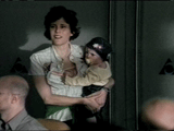
Forty-one years ago today, John F. Kennedy was assassinated in Dallas. In what is surely one of the weirdest commemorative acts ever, this morning the Scottish company Traffic released JFK Reloaded — a game that challenges you to take the role of Lee Harvey Oswald and shoot the president in precisely the same way, with the same number of bullets, as the original sniper. The closer you get to reality, the higher your score goes. There’s even a contest: The company is giving away $100,000 to whichever player gets closest to a perfect 1,000.
As you might imagine, the outrage was swift and ferocious. By my last count, there have been 364 news stories on Google News alone, and Kennedy’s family has officially called the game “despicable”. But judging by the coverage, no-one had actually played the game itself.
So my editor at Slate called me up and suggested we do precisely that. My review is online now, and here’s a taste of it:
When you peer through the rifle scope, the faces of JFK and Jacqueline Kennedy (and Texas Gov. John Connally and his wife Nellie) are completely recognizable. These are real people who still have immediate living relatives—or, in the case of Nellie Connally, are still alive. While the game’s ostensible purpose is simply to re-kill Kennedy as accurately as possible, you can perform any number of alternative scenarios. Shoot the driver first, and the motorcade comes to a halt, allowing you to pick off anyone you want. Or sometimes the driver dies with his foot on the accelerator, driving the car off the road and into a lamppost. You can, if you wish, kill Jackie instead.
When I finally managed to kill JFK and watched his head blow open while he flopped forward like a rag doll, I was genuinely horrified. The game wants you to think about what’s happening as a mere physics experiment, but you can’t, nor would you want to. Because it’s focused solely on the narrow question of whether you can replicate Oswald’s shots, it doesn’t try to achieve the sort of catharsis that is supposed to come from wrenching art.
You can read the rest of it for free here! And as always, if you have any thoughts about it, hie thee to The Fray, Slate’s discussion area, where intelligent comments are always welcome.
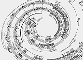
For hundreds of years, composers have argued over what’s the best way to represent music on the page, and many have experimented with weird new modes of notation. But until I read a piece this week in the New York Times about the avante-garde performer Margaret Leng Tan, I’d never heard of George Crumb. Crumb is famous for drawing his scores in hallucinogenic shapes evocative of the mood he’s trying to set, such as the spiral-shaped score for “Spiral Galaxy: Aquarius”, pictured above. I wish more of his scores were online — they’re quite trippy to look at.
Music is, when you think about it, one of the strangest challenges in the field of information representation. Acoustic instruments can do all manner of subtle things: How do you accurately score the bend and vibrato of some of the notes in a B.B. King solo? DJing presents even more challenges: One of the coolest things I’ve ever seen is the booklet on how to musically score a sequence of scratches on a record — the “Turntablist Transcription Method” produced in 2000 by a trio of DJs. (You can download the entire thing here in PDF form.)

Some brilliant Latvian geeks made a sequence of images that, when viewed in stop-action animation, shows a robot-like man walking. They stenciled the images onto various public places, like the telephone box pictured above. Then they took snapshots of all those locations, and assembled them into a brilliant online flip-book: As it zips through all the locations, the man appears to walk. You can pause the movie on any frame to see that individual picture. It’s just crazily cool.
Oddly, this reminds me of an idea I had a while ago about Tivo. Advertisers are worried that Tivo users are zipping past TV ads in superfastforward. So why don’t they simply embed an advertisment within the normal ad that becomes visible only when you’re speeding through the TV spot at high speed? Watch the ad at regular speed, and you see the regular ad; watch it at high speed and you suddenly “see” the secondary ad — perhaps some sort of animation that works precisely like the one above. Think of it this way: A normal TV ad is 30 seconds long, with 30 frames per second, for a total of 900 frames. I don’t know precisely how fast Tivo goes, but let’s say you can whip through a normal at in four seconds. That means you only see 117 frames. So what an advertiser should do it create a secondary ad composed of those 117 frames, which pops into existence when you go on fastforward. It would be, of course, maddeningly difficult to create one ad that works in these two modes, but what could possibly be more awesome? Hell, you’d have people frantically watching TV in hopes of seeing it.
(Thanks to Plastic Bag for this one!)
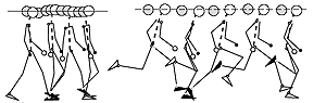
Did humanity’s ability to run long distances turn us into the world’s dominant species? That’s what a couple of scientists — Dennis Bramble of the University of Utah and Daniel Lieberman of Harvard — argued last week in Nature (PDF link). Many animals are much faster than humans at sprinting short distances, but they have no endurance. Humans are one of the few animals (other than dogs, hyenas, and horses) that can run for minutes and even hours at a time. Running imposed a big cost on homo erectus: A physiology engineered for the marathon is ill-suited for climbing trees, which means we couldn’t as easily forage for fruit or escape predators. But, as the scientists argue, long-distance running allowed us to roam more widely in search of the high-protein food necessary to evolve our huge brains, small intestines, and small teeth, all of which eventually allowed to us to create the Xbox and The Simple Life. Ooo yeah.
The scientists have compiled a list of 26 physiological features that make humans human, all of which evolved partly to allow us to run — such as the ligament at the back of the neck that allows us to hold our heads steady even while bounding (as per the diagram above, taken from the Nature paper.) Most other animals can’t do this, which is what got Bramble and Lieberman originally interested in this problem. Thirteen years ago, as the New York Times reports, they were watching a pig run on a treadmill …
“Dennis and I noticed how the pigs can’t hold their heads still while running,” Dr. Lieberman recalled. “Any good human runner keeps his head still because of the nuchal ligament, a tendon in the back of the neck.”
Interestingly, another crucial part of our ability to run is our development of a big, meaty butt. Even our closest relatives — apes, chimps and monkeys — don’t have them:
Have you ever looked at an ape?” Dr. Bramble said. “They have no buns.”
Dr. Lieberman, a paleontologist, explained: “Your gluteus maximus stabilizes your trunk as you lean forward in a run. A run is like a controlled fall, and the buttocks help to control it.”
So the next time you’re in the gym checking out your ass in the mirror, take comfort: All civilization rests upon what you see.

Every once in a while, I find a web site of such studied weirdness that I can’t figure out whether it’s a hoax or not. Live-Shot is one such site. According to its self-description, it is a telepresence hunting experience: Log onto the Live-Shot system, and you use your computer to remotely take control of a .22-caliber rifle. Become a member for $15, and you enjoy a refreshing break at work by virtually blowing the crap out of a paper target. And if that’s not quite cybernetically manly enough for ya, just hold on for a bit — they’ll soon be launching a new system that lets you actually kill animals. As the site notes:
We are currently working on a very comfortable, ADA compliant blind which will house the LIVE-SHOT shooting system. Once this and the perimeter fencing are completed, will we be able to offer a unique computer assisted hunting opportunity. Disabled and handicapped hunters, as well as others who would like to try this type of hunting, will be able to use our system.
That Corsican Sheep above is an example of the creatures who will soon be feeling the rage of some insurance adjuster in Poughkeepsie. If there is any part of your mind left unblown, I guide your attention to a video of the system in action.
(Thanks to Len for this one!)

Here’s a surreal bit of research: Apparently the mere act of thinking about Superman makes us suckier people. A couple of researchers discovered this by accident, while they were pondering the intriguing effects of “priming” — using a couple of suggestive words to affect someone’s behavior. Researchers have known for a long time that exposing subjects to words can affect their behavior; for example, one study showed that people exposed to helpful words were more likely to help a friend pick up some spilt pens.
Those effects are normally pretty short-term, so the researchers wanted to know how long they’d last for. So they took a bunch of students and asked them to write up a list of attributes of various superheroes, one of which was Superman. Later, they were given the opportunity to volunteer for a community program. The results? As the New Scientist reports:
Students who thought of Superman volunteered much less of their time than those who thought about other superheroes. Furthermore, Superman-primed subjects were significantly less likely to show up at a meeting for volunteers held three months after they were initially asked to participate.
The reason, believes Nelson, is that asking people to compare themselves to an exceptional individual makes them realise their shortcomings. Whereas thinking about a general category encourages people to identify the strengths they have in common.
(Thanks to Noah for this one!)
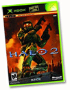
Here’s a neat cultural moment for you: The strategy guide for the video-game Halo 2 has become Random House’s fastest-selling nonfiction book since Bill Clinton’s My Life last summer. As Random House’s press release reports, the Halo 2 guide sold over 270,000 copies on its first day, Nov. 9. In comparison, Clinton’s book sold 400,000 copies on its initial day.
For even more Halo 2 punditry, check out my Slate review of the game, blogged below …
Spoiler alert! This entry contains a few plot points to the game Halo 2 — so stop reading now if you don’t want to have any surprises ruined.
Slate has published my latest video-game column — and this one is about the curiously nuanced politics of Halo 2. In the original Halo, you played as a human fighting The Covenant, an alien army. In the new one, you do pretty much the same thing … until about two hours into the game, where you suddenly find yourself playing as an alien. The perspective flips back and forth throughout the game, and it neatly queers the usual black-and-white simplicity of the average first-person shooter. As I note:
This inverted perspective extends, brilliantly, to the manual that comes along with the game’s “Limited Collector’s Edition.” While the game’s plain-jane $45 version comes with a guide written from the human perspective, the bulked-up $55 edition (it also comes with a DVD) has the exact same handbook written from the alien perspective. Both books cover the same material—the weapons, the combatants, the Byzantine back story—but with hilariously different interpretations. The human guide calls the littlest aliens “Grunts” and says that “they will often panic when faced with superior forces.” The alien guide calls them by their actual name, Unggoy, and purrs that they “will as ever fight well with their comrades.” More pointedly yet, the aliens refer to their defeat in the first game as “The Atrocity at Halo.” Who wrote this thing, Noam Chomsky?
Of course, you could argue just as easily that Paul Wolfowitz wrote the humans’ guide. The narrative seems awfully familiar: a “good” force, convinced of its moral superiority, hacking through a faceless, undeterred horde that’s driven by religious fervor. Ahem.
You can read the rest of the review for free online at Slate! And, as always, if you have any thoughts to share on the subject, feel free to post ‘em in The Fray, Slate’s discussion area, where intelligent comments are always welcome.
In the wake of my recent posting about the politics of map-making in the recent election, Barry Ritholt sent me an interesting collection of maps he’s been gathering, representing different slices of data — including population densities, how previously-slave-owning states voted versus non-slave-owning ones, and tax transfers (i.e. how taxes from the blue states props up the fragile, dying economies of the red states).
But the most interesting map of all? How youth voted. That map above shows who would have been elected had the election been decided solely by people age 30 and under — and it is, of course, Kerry by a landslide. After making a big hullaballoo about the importance of this year’s youthquake, hipster activists were a bit chagrined to discover that the percentage of the electorate that were young remained at 17 per cent, precisely the same as in 2000. It’s not that the youth vote did not increase in size. In fact, it grew: About 20.9 million Americans under 30 voted this time around, about 51.6 per cent of those eligible; that’s 4.6 million more than in the last election, when only 42.3 per cent of eligible young voters went to the polls. The problem is, while the youth vote went up, so did the amount of voters in every other age bracket, meaning that youth’s overall percentage of the national vote stayed the same.
Still, it’s worth looking at that map and pondering what the future holds. This is not to say that as today’s young voters age, they’ll remain the same ideologically; they could well become more conservative with age. And, as an intriguing study by the JFK School of Government recently discovered, college-age voters have a complex stew of driving forces, ranging from religion to cultural pluralism.
These days, computers have gotten very good at doing text-to-speech — i.e. reading text on a screen out loud to you. That’s particularly useful for the blind or hard-of-sight, or for phone-information applications, where you’re parsing data via a telephone. The only problem is, the voices for these applications tend to be rather bland. A while ago I accidentally turned on Microsoft Word’s text-to-speech mode, and nearly shrieked out loud when the computer began reading out my document to me. It wasn’t so much that the computer was talking (though that’s pretty weird itself) but that the voice sounds like Stephen Hawking shot up with tranq darts. Isn’t there some way to get a more appealing automated voice?
Well, yes there is — with “Let Them Sing It For You”, a hilarious little web application created by Erik Bùnger. Go to that site and type in a sentence you want to hear read aloud, and the web site will reproduce it — with each word sung by a different pop star, the audio stripped out of an actual pop song. It is just compellingly berserk. I typed in “I have no pants” and simply could not stop laughing. The “I” is a clip from Chris Izaak’s song “Wicked Game”, and, well, things get even stranger from there on in. Bùnger suggests several innovative uses of his tool:
Send your friend a love declaration, Christmas wish or poem sung by Judy Garland, Lou Reed and Christina Aguilera. Authorities can replace their streamlined phone answering voices with an unruly mix of mythological and sexually inviting voices belonging to the pop world’s greatest icons.
If you discover that the database doesn’t yet include a specific word you’re looking for, go find a song that includes it, then notify Bùnger; he’ll strip it out of the song and input it into the database.
(Thanks to Joey for this one!)

The giant-squid beat just keeps getting weirder and weirder. According to the BBC:
Police in Peru have seized about 700kg of cocaine hidden in frozen giant squid bound for Mexico and the US.
The drugs - worth about $17.5m - were sealed in several layers of plastic and other wrapping material and covered in pepper to divert sniffer dogs.
No comment necessary — or, really, even possible.
(Thanks to Josh, David, and Jeff for this one!)
A couple of years ago, Disgruntled Worker was the go-to web site for hilarious stories of workplace idiocy and the infinite moronicity of one’s superiors. In a bit of gorgeous irony, the site recently shut down after the editor quit over “wages, benefits and working conditions at this magazine”.
Now the mantle has been passed to clientcopia, a site devoted to “stupid client quotes” — comments made by people for whom you are forced to work, and whose intelligence asymptotically approaches zero. Scan the Top 20 if you want the highlights, but I found it just as much fun to go through them all sequentially. Each individually is funny (and sad), but the effect only truly builds up if you read about 30 in a row. One of my faves:
Client: Could you use a different font for every name, you know make it cool.
Me: Uh, that’s probably not going to look so good, it’ll be all cluttered and ugly
Client: No, it’ll look cool, so let’s do it.
after doing what they want…
Client: Now it looks all cluttered.

Bathsheba Grossman is an insanely cool artist. As she describes herself on her website, she is:
I’m a digital sculptor, combining prototyping technology with metal crafting skills to create abstract geometries in space.
My work explores order in 3D: the tension between inside and outside, the point at zero and the point at infinite distance, how the axes can be alike and different. I got interested in these ideas as a mathematics student, wanting to cross over from formal abstractions into working with physical shapes, and sculpture gave me the way.
She designs her stuff on a computer, sometimes writing programs to help figure out the weird dimensionality of the objects, then prints it on a 3D printer. That trippy thing pictured above is called “Moon Pi” and is actually a puzzle. If you really want to fry your noodle, check out her 120-cell.
She’s like Escher, if Escher had sculpted. (Actually, the idea of Escher having access to computer-assisted design and 3D printing is almost scary.)
(Thanks to ntexas99 and Bram for this one!)

Last night was the first round of the Jeopardy College Tournament. One of the contestants, Kermin Fleming, is a comp-science student from Carnegie Mellon University, and he was on top of the pile when he made a final wager: $1337.
Trebek couldn’t figure out why the heck Fleming would pick such a weird number to wager, but geeks nationwide were thrilled. Because, of course, in leetspeak, the number 1337 stands for “‘leet” — or “elite”, for those of you who actually go out in the sun every once in a while.
Man, I can’t wait for 2040, when nerds are running for president. The cultural references in the debates are just going to rock.
(Thanks to Boing Boing for this one!)
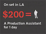
I love it. For the video for her song “World on Fire”, Sarah McLaughlin took the average cost of a music video — $150,000 — and donated it to sustainable-development charities in Africa. Then she shot the video for $15, by using a single, live handheld-camera picture of herself.
That’d be cool enough right there. But she went one step further, and used video itself as a piece of agitprop, using Flash-style animated graphics to neatly illustrate the various component costs of producing a video — like that $200-a-day production assistant pictured above — and how much each would buy of food, tools, medicine, or whatnot in Africa. You could argue this is overly preachy, but hey, she’s a folk singer — it’s her job to be numbingly didactic. Plus, she’s kind of, y’know, right.
But, putting on my info-nerd cap here for a second, the video is also remarkable for its sheer interfacial elegance. Check out those modernist-a-go-go animated icons; watch the simple but effective visual metaphors it builds up. It’s like one of those 1970s edutainment animation film-reels they used to have kids watch in grade school. Just lovely!
(Thanks to W=UH for this one!)
If you’ve been reading the news, you’ve no doubt heard about the many problems with voting machines — and the conspiracy theories that abound about them. Observers have noted that in Florida, counties that used optical-scanning counters registered landslide-class Republican wins, despite the fact that polling data indicated both parties were in a dead heat. The Democrats have even started raising hell about it. The press isn’t writing a whole lot about it, probably because, sadly, I think they’re worried about seeming like left-wing flakes.
The thing is, one needn’t be a Democrat to be worried about whether electronic voting machines screwed things up (though it probably helps). No, the problem is that America’s electronic voting machines were doomed to create this level of distrust. It’s in their architecture.
After all, with no paper trail, there’s no way to prove how people really voted. Thus there is no way for the Republicans to definitively shut the Democrats up about this. Just as problematically, there’s no reason for the Democrats to trust the results. And, worse, the software on these machines is closed-source — and the companies who make it will not allow anyone who so desires to scrutinize the code for insecurities. These companies simply ask that people “trust them”.
The lesson? Secrecy doesn’t work. The culture of corporate silence around these black boxes is bound to produce paranoid fears in those who lose the election. Until they’re open and transparent, it will be impossible for losers to have faith in the electoral system.
(Thanks to Jason and Rachel for this one!)
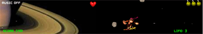
A chimpanzee, blasting away at an onslaught of asteroids, picking up powerups and avoiding certain death — all while FLYING PAST SATURN LIKE THE CASSINI PROBE ITSELF. What is not to love about this game?
Indeed, it’s making me realize that Flash is producing a renaissance in the lost art of the 2D arcade sidescroller.
(Thanks to El Rey for this one!)

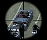
With its Grand Theft Auto series, the folks at Rockstar Games have become justly famous for producing amazingly realistic 3D environments. But since their newest game — GTA: San Andreas — is based on several real-life locations, how well does it match up to the real world?
To find out, GTAGaming.com took pictures of a bunch of locales in the game that were modelled off buildings and sites in L.A., Las Vegas, and Nevada, and checked them against pictures of the originals. The matches are nothing short of stunning. Those snapshots above? The one on the right is the real-life Transamerica Pyramid in San Francisco, and the one of the left is the same building as viewed in the game. If they didn’t tell you which is which, I’m not sure you’d be able to tell ‘em apart.
(Thanks to Waxy.org for this one!)
In the lovely-and-cool category, I offer up the “Hammond Flower”, an online interactive music-toy by Amit Pitaru. It’s Amit’s version of the Hammond B3 organ, one of his favorite instruments. As he describes it:
I’ve always enjoyed playing the B3 ‘backwards’ - instead of first setting the drawbars and then playing the keyboard, i would hold one note down on the keyboard and play with the drawbars, investigating the ingredients of a note rather than the notes themselves. The Hammond Flower instrument lets me do just that. It provides an alternative interface to the B3’s drawbars, and then extends the metaphor by adding a dissonance component. In addition, A visualization engine (center part) translates the overall sound texture into a visual architectural element.
It’s totally mesmerizing.
(Thanks to Waxy.org for this one!)
According to Movable Type, this is a milestone here at Collision Detection — my 1,000th post. Every once in a while I think, ‘Hey, maybe I should dump all my posts into a text file and find out how much I’ve written!’ The only problem is … I suspect the figure would scare the living crap out of me.
It is also possible, though, that I’d find out something interesting. Recently, Tom Coates celebrated the fifth anniversary of his excellent Plastic Bag blog by collecting together his 4,175 posts, doing a word count, and realizing he’d written over 1.1 million words — 1.3 times the size of the English-language Bible. Then he put the whole word-dump online and invited anyone to parse the data in interesting ways.
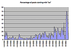
The results are incredibly cool. One of Tom’s readers had recently complained that Tom was too frequently starting his postings with the word “so.” Cal Henderson, one of Tom’s friends, decided to find out whether this was true, so he crunched the numbers to produce the first graph you see above, which plots out the frequency of posts beginning with “so”. Tom was forced to admit that things were looking pretty bad:
As you can see - a startling indictment and as Cal said to me on AIM, “evidence that you’re getting worse”.
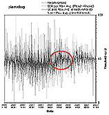
Equally as interesting was the analysis that Richard Sodenberg performed. He measured Tom’s posts against the “Flesch-Kincaid scale”, a metric that determines the reading level in the US educational system that might be necessary to read one of Tom’s posts. That’s the second graph above: As you can see, in the early years Tom was all over the place, zipping everywhere from “infantile depths” to “unintelligibility”, as he puts it. But in November of 2002, the graph starts to even out — Tom began writing in the more “ideal” middle range of intellligibility.
Why? Interestingly, that date — November 2002 — is precisely when he switched from using Blogger to using Movable Type as his blogging system. Tom says that according to some of the data analyses he’s received, his posts under Movable Type have been getting longer and less frequent. Possibly that means he’s spending more time on each posting, which could well improve intelligibility. And, as he notes, Blogger does indeed seem to encourage people to post shorter, one-or-two sentence postings than does Movable Type. I too have noticed that, though I can’t quite figure out why: Any theories out there?
As for me and my postings, without doing any data analysis I’ve noticed a few trends:
i) I, too, have begun posting fewer and longer postings. This probably also because …
ii) I started off by posting a few times every day, but now I tend to save up my blogging for enormous, sprawling, three-or-four-hour sessions twice a week. That means this blog tends to lurch forward in big spasms. That’s partly because I’ve been far busier at work in the last year; I’m also travelling ffor work more frequently, and when I’m travelling I’m almost never at a computer, and thus cannot post.
iii) The amount of giant-squid postings have risen dramatically in the last year. The amount of postings about robots and artificial intelligence have remained pretty constant. I can’t figure out if there’s a connection here.
(Thanks to Boing Boing for this one!)
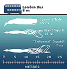
Fresh on the heels of a fall that is simply chock-a-block with giant-squid news, comes the BBC’s report on the capture of a “colossal squid” — a creature that is so bloody huge that scientists have no idea how big it grows. The chart overhead from the BBC shows the comparative size of a sperm whale, a giant squid, and a Mesonychoteuthis hamiltoni, the official name of the colossal squid. Oh, yeah, and the BBC put a double-decker bus in there just to show how totally screwed you’d be if you met one of these babies in a dark alley.
The colossal squid not only has the biggest beak of any cephalapod, but has “unique swivelling hooks on the clubs at the end of its tentacles,” which is, ah, bad. Indeed, so krakenesque is this thing that the scientists sound like extras in a monster-horror movie:
“When this animal was alive, it really has to be one of the most frightening predators out there. It’s without parallel in the oceans,” said Dr O’Shea, whose work is sponsored by Discovery Channel.
(Thanks to Tony for this one!)
Hey Yankees, sufficiently disappointed by the election that you’d rather just leave the country? The brilliant folks at THIS magazine — the best left-wing magazine in Canada, and, in fact, all of North America — have put together a hilarious website: Marry an American, urging Canadians to export citizens from south of the 49th parallel. Interestingly, it is getting so deluged with hits these days that the site is almost unreachable.


So the election’s over, and President Bush is confidently announcing that he’s won a strong mandate — as he put it in his speech yesterday: “I earned capital in the campaign, political capital. And now I intend to spend it.” Meanwhile, the Democrats are morosely pondering the reasons they lost not only the electoral vote but the popular one too, to say nothing of various senate and house seats. And the predictable punditry has begun about “middle America”, “liberal elites,” and the enormous cultural divide in this country.
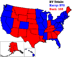
The thing is, the red/blue split is obviously very true in sense — which is the electoral college. With its winner-take-all system, a state either goes Republican or goes Democrat, red or blue, with no phase transition in between. But it’s equally true that this red/blue geographic divide is utterly artificial, because the vote in most states was incredibly, remarkably close. It doesn’t feel close, because the media is obsessed with continually reminding us of red-blue electoral-college map, with its lovely evocation of regional and cultural war: Lookit all that huge, sprawling red space, folks, and those blue states huddled out near the cold water! (That first map above is, by the way, from USA Today.)
But change the map and you change your view of the country. Jeff Culver recently created the amazingly cool second map you see above, which shows the actual division of votes, registered as a mix of red and blue to their proportions. As he shows, the country is in reality mostly “purple”: There nearly as many Democrats as Republicans out in the “heartland” states, just as there are nearly as many Republicans as Democrats in the “liberal” states. These voters probably all massively, heatedly, psychotically disagree with one another about who should be president. But their views are not determined solely by geography.
Call me nuts, but I think one of the biggest challenges American media and punditry has is an interface problem: They are stuck on one dramatic, manichean way of viewing the data. Imagine if TV news and newspapers regularly showed the second map every time they talked about the election. How can you look at that map and talk about some enormous, festering divide in the country? You can’t. As any scientist or graphic artist or video-game player knows, the tools you have for visualizing your situation enormously determine how you think about it.
Sure, merely looking at a purple map wouldn’t change the president’s mind. Like any politician fighting in the electoral college, he only ever cared about tipping enough states over. No president truly fights to win the popular vote. Still, symbols are powerful things. The red/blue map has become the most powerful way of thinking about modern America, yet also the most false.
(Thanks to Boing Boing for this one!)
I'm Clive Thompson, the author of Smarter Than You Think: How Technology is Changing Our Minds for the Better (Penguin Press). You can order the book now at Amazon, Barnes and Noble, Powells, Indiebound, or through your local bookstore! I'm also a contributing writer for the New York Times Magazine and a columnist for Wired magazine. Email is here or ping me via the antiquated form of AOL IM (pomeranian99).
ECHO
Erik Weissengruber
Vespaboy
Terri Senft
Tom Igoe
El Rey Del Art
Morgan Noel
Maura Johnston
Cori Eckert
Heather Gold
Andrew Hearst
Chris Allbritton
Bret Dawson
Michele Tepper
Sharyn November
Gail Jaitin
Barnaby Marshall
Frankly, I'd Rather Not
The Shifted Librarian
Ryan Bigge
Nick Denton
Howard Sherman's Nuggets
Serial Deviant
Ellen McDermott
Jeff Liu
Marc Kelsey
Chris Shieh
Iron Monkey
Diversions
Rob Toole
Donut Rock City
Ross Judson
Idle Words
J-Walk Blog
The Antic Muse
Tribblescape
Little Things
Jeff Heer
Abstract Dynamics
Snark Market
Plastic Bag
Sensory Impact
Incoming Signals
MemeFirst
MemoryCard
Majikthise
Ludonauts
Boing Boing
Slashdot
Atrios
Smart Mobs
Plastic
Ludology.org
The Feature
Gizmodo
game girl
Mindjack
Techdirt Wireless News
Corante Gaming blog
Corante Social Software blog
ECHO
SciTech Daily
Arts and Letters Daily
Textually.org
BlogPulse
Robots.net
Alan Reiter's Wireless Data Weblog
Brad DeLong
Viral Marketing Blog
Gameblogs
Slashdot Games
