
Here’s a cool use of publishing-on-demand technology: Cameron Kelly proposed to his girlfriend Angie Kreimer via a 113-page self-published book he created at Lulu.com — 50 Reasons Why You Should Marry Me and 51 Reasons Why I Should Marry You. The book includes 101 pages of text and 44 color photographs. “It’s a sort of prose-poem, with pictures,” Kelly said. According to a Lulu.com press release, some of the reasons he claimed he was marriage-worthy included:
- I clean the bathroom every week.
- I’m going to look like Sean Connery when I’m 65.
- You don’t even have to change your initials!
Apparently the book was met with a one-word reply — “yes”.
I kind of love this idea. It takes the genius of publish-on-demand technology and pushes it to its logical extreme: A book published for a niche market of precisely one person. That’s pretty far down the Long Tail! Though who knows? Maybe other people will buy it and read it. It reminds me of teenagers using PowerPoint to craft corporate presentations arguing why their allowance should be increased.
Artists always paint the world around them. But since today’s generation of young artist have grown up living partly inside virtual, video-game worlds, I’ve long looked forward to owning some oil paintings done of scenes from games.
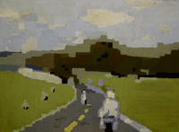
Looks like my chance is finally here! A young artist named Jeremiah Palecek in Prague has begun selling painting he’s done of in-game scenes, including ones from Super Mario Bros., Joust, Counterstrike, and the racing game Road Rash (pictured above). As he notes:
I believe it is important to create permanent replicas of digital media because it is something that so many of us experience.
Precisely my point: Games are places we live in as deeply, or in the case of some really hardcore online-world gamers, more deeply than the physical world. We need some art that wrestles with our psychic and visual relationship to these places!
Another artist working in this area is my friend El Rey, who has been painting a series of gorgeous, impressionistic scenes from Half Life 2. You can see a few of his works in progress here; this is a portrait of Alyx Vance, one of the game’s protagonists (Wikipedia entry on her here):

That’s just gorgeous.

Here’s an interesting study: Apparently the life-expectancy of a bestselling fiction book has been steadily shrinking. Or to put it another way, more and more books are becoming bestsellers — but for shorter and shorter periods.
This data comes from a study conducted by Lulu.com, the online self-publishing company. It found that back in the 1960s, the average bestselling novel remained on the New York Times’ fiction list for 21.7 weeks — and only about three novels a year made it to that exalted status. But in the 2000s so far, the average bestselling novel stays on the Times’ list for a mere 3.3 weeks — but over 18 books each year do this.
In essence, the very concept of a bestseller is changing. A bestseller is no longer big, huge, rare book that dominates the national discourse for months. Instead, it’s a quick hit, a temporary talking point that flares up and then vanishes. As the CEO of Lulu.com puts it …
“The blockbuster novel is heading the way of the mayfly,” says Bob Young, CEO of Lulu.com, referring to the famously short-lived insect.
The culprit here? The 500-channel universe, and its ferocious stepchild, the Internet. The sheer volume and variety of media has so exploded in the last twenty years that it’s easier to make a quick profit aiming for a niche than aiming for the mass public: All those super-short-lived bestsellers were, I’d wager, latching their wagons either to a) some highly quotidian topic — i.e. some trend destined to vanish in a few months, taking the book with it — or b) some specialized audience that will rear up, buy the book en masse, but, being a niche, be unable to infect the broader public with their enthusiasm, thus again producing a narcotically intense but narcotically brief popularity-span for a book.
The wild card here is how the Internet, and social technologies like blogging and Google, affect popularity. As Clay Shirky puts it, the old adage in the cultural industries was “filter, then publish”: I.e. the publishers would sift through 10,000 manuscripts, pick their favorite 10, and publish those books. Ideas, in that world, come along only rarely and are thus mulled over by the public for a good long while. But in the Internet age, the paradigm is inverted: We publish, then we filter.
These days, everyone and their dog sets up a blog and expounds upon cool stuff, and the 10,000-fold torrent of ideas hits the public directly like an avalanche. Ideas aren’t rare any more. To keep from being deluged, we, the audience, do our own filtering, our own editing. We pick from amongst the online offerings by finding stuff on blogs we trust, or emails from friends, or “you may also like this” recommendations on e-commerce sites. In a publish-then-filter environment, we rely less on editors and more on tools that help us filter the opinions of our trusted friends and communities.
That’s the paradigm that’s emerging, anyway. So how is that going to affect what books become popular — and stay that way?

A while ago I blogged about Tringo, the video game that became popular inside Second Life — a game inside a game! I ended up writing my latest Wired column about Tringo, including a trip inside Second Life to see Tringo culture firsthand, with Wagner James Au — the superb “embedded” Second Life journalist who originally wrote about Tringo — as my guide. (That’s a picture of me in the game, above.) The piece is online for free here, and I’ve put a permanent copy below too:
The game within the game
by Clive ThompsonThis is the story of a game that became a hit — inside another game.
The story begins with Second Life, the online multiplayer world where players use a simple scripting language to create virtual items — buildings, clothes, vehicles, toys. In Second Life, you get enormous street cred for being creative and figuring out new ways to socialize. So in December 2004, one of the players — an Australian whose screen name is “Kermitt Quirk” — got an idea: Why not create a video game that’s playable inside Second Life?

Apparently the hottest new Christian name is “Nevaeh” — “heaven” spelled backwards. It traces it genealogy to a single cultural big bang: In 2000, Sonny Sandoval, the singer for the Christian-rock unit P.O.D., appeared on MTV and introduced his baby daughter Nevaeh. He explained the provenance — “Heaven spelled backwards” — and apparently the country was totally smitten.
According to the New York Times:
The spectacular rise of Nevaeh (commonly pronounced nah-VAY-uh) has little precedent, name experts say. They watched it break into the top 1,000 of girls’ names in 2001 at No. 266, the third-highest debut ever. Four years later it cracked the top 100 with 4,457 newborn Nevaehs, having made the fastest climb among all names in more than a century, the entire period for which the Social Security Administration has such records. [snip]
The name has hit a cultural nerve with its religious overtones, creative twist and fashionable final “ah” sound. It has risen most quickly among blacks but is also popular with evangelical Christians, who have helped propel other religious names like Grace (ranked 14th) up the charts, experts say. By contrast, the name Heaven is ranked 245th.
Man, never underestimate the tendency of the American public to slavishly adopt the most aggressively daft bit of fashion or behavior evinced by their Olympian gods, the celebrities. It’s like when I checked out the NameVoyager baby-name application last year, and discovered that the 1980s TV show Remington Steele apparently caused an epidemiological surge in the number of sons afflicted with the name “Remington”. Of course, “Nevaeh” is an order of magnitude sillier even than Remington, simply because it takes an linguistic epiphany that would embarass a stoner (“Hey dude — did you realize that butter spelled backwards is … rettub?” “Duuuude.”) and forces some poor kid to live with it until they die.
It’s also passingly ironic to see evangelical Christians getting super excited about spelling things backwards. Last time I checked, wasn’t that supposed to have kinda, y’know, necromonical connotations?

Highway traffic is an enormous hazard for wildlife; thousands of endangered animals die every year after getting hit by cars and trucks. (To say nothing of the humans that die in these collisions — slamming into an enormous black bear at 60 miles an hour is kinetically equivalent to driving into a brick wall.) Anyway, there’s now an international movement afoot to build traffic overpasses and underpasses catered specifically to animals. A story in yesterday’s New York Times Science section describes one that’s located 50 miles outside Banff, Alberta:
Approached from the woods, the crossover resembles any other sloping hill, covered with brushy grass, shrubs, saplings and even a clump or two of pussy willow.
Earthen berms on either side hide the road and mute the noise of the tens of thousands of cars that pass by daily, winter and summer.
Animals have worn a trail along one edge and, at the top, leave prints on a cleared stretch of dirt, a so-called track pad, monitored by motion-sensitive cameras with night-vision lenses.
It’s working: Researchers have counted tens of thousands of wolves, bears, cougars, and other animals using the overpass in the two years since it was built.
Now here’s a really weird idea: Would this work in an urban setting? Though we tend not to think of cities as hosting much wildlife, in reality places like New York or Toronto teem with everything from squirrels to foxes. They run into problems with traffic too. A terrific story in a recent issue of New Scientist explaining why squirrels are so often greased by cars: They evolved over millenia to cross open spaces as quickly as possible without wasting time to check for predators, because there was nothing they could do hide in that situation, and any delay was just going to increase the likelihood that they’d get killed. (It’s an open question as to whether squirrels will evolutionarily respond to the curious behavior of cars — “predators” that move in predictable straight lines and can be avoided with a modicum of watchfulness.)
In the meantime, though, I wonder if a city could experiment with building little overpasses or underpasses for squirrels? They could actually be quite lovely — metal or wood archworks spanning roads, festooned with climbing vines. Granted, squirrels are hardly endangered species, and it’s possible that automobile deaths constitute an essential herd-culling that is keeping squirrels from booming in population, overrunning cities, and demanding voting rights. But at very least it’d be pretty hilarious to watch ‘em scurrying back and forth across overhighway trellises!

I’ve written several times about the “Uncanny Valley” theory — the idea that as computer-generated depictions of humans become more and more photorealistic, they look creepier, more ghastly, and more cadaverlike. The concept is simple: When we look at a cartoon-like drawing of a person, like Charlie Brown, our brains fill in the missing information, and the cartoon seems warm, cute, and lifelike. But when an animated version of a human becomes incredibly close to being real, we start focusing instead on the tiny details that aren’t right: The slack skin, the not-quite-dewy-enough eyes, the stiff body movements. Paradoxically, the more realistic the human becomes — the worse they look. Sure, enhanced graphics look terrific when lavished on static things, like scenery or smoke or bullets. But the human face? Our video-game graphics aren’t up to it — and, if you believe the Valley theory, may never be.
The Uncanny Valley effect has become painfully, itchingly obvious in today’s video games. Whenever a game comes out with cartoonish and stylized humans — like the anime-style Final Fantasy series — they look wonderful and lively. But whenever the game designer gets obsessed with being “cinematic” and “superealistic” and producing “cutting edge graphics”, woof woof, meow meow, the results are just unwatchable — as with, say, the “lifelike” characters in Half Life 2 that cavort about like a corpsetastic army of zombies.
After hurling themselves against these shoals and crashing again and again and again and again and again, wouldn’t you imagine that game designers would learn their lesson?
But no. The advent of the Xbox 360, the Nintendo Wii, and the PS3 have all got them whipped into a fresh new lather about creating “photorealistic” humans. Thus it was that I came across the promotional trailer for Heavy Rain, the sequel to the terrific game Indigo Prophecy that’s slated for the PS3. I clicked on it, wondering … hmmm, are the PS3’s graphics finally so good that the designers have climbed out of the Valley?
Nope. They’ve trudged in ever deeper. Check out this clip, in which a young girl does a “casting call” and delivers a long monologue into the camera. Prepare to scream and scream again. Seriously: It’s goosebump-inducingly bad. Her lips attempt to smile, and pull back in some unholy rictus of a grimace; her skin slides like dead sheets of atrophied flesh along the surface of her bone structure; and her eyes — my god! Her eyes! It’s like looking over the edge of the flat earth into an endless infinite howling darkness, unto which an anvil could be tossed and fall for forty days and forty nights and not yet reach the inky awful depths of her soul.
This wouldn’t be so bad if the designers were actively trying to create some eldritch, sephulchral nightmarescape straight out of Goya’s Black Paintings. But no … they’re trying to create a spunky, cute, realistic girl.
God almighty, these people must be stopped. This stuff is hideous beyond description, and I describe things for a living.
(Thanks to Jonn Wood for this one!)

This is great: Brandon Hansen at Omninerd decided to crunch some statistics on how long it takes him to commute to work, to see if there was some hidden way to shorten his drive. Sure enough, he discovered a few secret sweet spots in his local traffic, which are charted above. As he concluded:
Given the above data and analysis, what can be done to improve my commute times? Changing my morning or evening departure time looks promising. The best bet appears to be moving my schedule out a half-hour to 8:30AM and 6:00PM, bringing significant savings (about 7.5 minutes of commute time per day) without getting too far from normal business hours. Spread out over 50 work weeks, that results in a total savings of over 30 hours a year — the equivalent of about a 38% boost to my existing 80 hours of vacation.
Here’s an idea for Detroit’s ailing Big Three: Why don’t our onboard car computers do this sort of thing automatically? They could spend a few weeks recording when your daily commute begins and when it ends, mix in some GPS telemetry, crunch it with a bit of Mapquest data and presto: A customized drive agenda, produced by automobile A.I.!
(Thanks to the J-Walk blog for this one!)
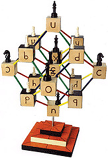
Modern mathematical logic uses a set of sixteen symbols crafted specifically to help you phrase precise logical statements: A dot stands for “and”, a vee for “or”, a horseshoe symbol for “if”. It’s a notoriously abstruse way of thinking, and many philosophy undergrads crash upon its shoals. But a rogue mathematician named Shea Zellweger thinks he has a solution: An entirely new alphabet designed to express logical concepts.
Zellweger has spent decades refining his new logical alphabet, and there’s a big site devoted to it here. But the central benefit of his new notation, he argues, is that his sixteen symbols are related to another: Symbols that mean the opposite of one another are literally the geometric mirror-image of one another — the symbol for “A and B”, a “d”, is a geometric flip of “h”, the symbol for the cognitively flipped idea of “not-A or not-B”.
These physical relationships between his logical letters, Zellweger says, allows a student to sensually perceive the relationships inherent in the language of logic. Here’s a picture of his 16 symbols, which lets you see how they relate:

The thing is, Zellweger thinks his logical language could transform logic the way that the Arabic number set — the one we use today, from 0 to 9 — transformed math after it replaced the use of Roman numerals. Roman mathematicians were hobbled by their crappy notation system. Roman numerals are rather arbitrary: You start off by counting with “I”s, then add a “V” when you get to five, an “L” when you get to fifty, a “C” when you get to a hundred, etc. If you create a multiplication table out of Roman numerals, you can’t spy any inherent order in the math, because the notational system of the numbers is arbitrarily chosen. But if you create a multiplication table out of Arabic numbers, you immediately see the relationships between numbers, because patterns in the number set — from 0 to 9 — emerge visually.
Zellweger’s logical alphabet works the same way. The symbols of mathematical logic, like the Roman-numeral system, are arbitrarily chosen; they don’t relate to one another. If you arrange them in a multiplication-table-like grid, they won’t display any symmetry. But Zellweger’s symbols do, as he proved by creating such a table. Even more wackily, he’s created a 3D sculpture — pictured above — and some gorgeous tesseracts that illustrate the deeper symmetries.
Okay, okay, this is pretty dry stuff. But what’s cool about it is that Zellweger has tackled one of my favorite topics: That your cognitive tools affect how you think. Give kids a better alphabet that represents the internal beauty of formal logic, he argues, and maybe they’ll learn it better. It’s much like Seymor Papert’s use of little toy robots to teach kids about geometry, computer programming, and logic. As he pointed out in an interview:
I also like the fact that one’s interaction with my notation is literally hands-on and physical, rather than just all in your head. Knowledge shouldn’t be disconnected from the body. The body should be used as much as possible as a part of the means through which we acquire and store knowledge. Why can’t logic be like that too?
(Thanks to Jonathan Korman for this one!)
So, taxpayer. Sick of watching your federal politicians dig the country deeper and deeper into debt? Ever think you could balance the budget, if only they’d hand the reins over to you?
If you lived in France, you could find out for yourself — because the finance minister, Jean-François Copé, is about to release an online video game that challenges you to design France’s federal budget, and drag the country back into the black. It’s called Cyberbudget, and it’s supposed to come out any day now. As Copé told The Guardian:
“The idea is that when we cut taxes, we can’t do it without creating deficits,” Mr Copé told France 2 Television. “In this game each French person can pretend they are the budget minister and make decisions to understand how much each [ministry’s] budget costs — education spending, military spending, how it’s all organised — and see what kind of decision we can make when we want to cut taxes.”
I love it! Why doesn’t the US government do the same thing? Then everyone could compare their budgets online, or even vote for their favorite one.
Of course, this description of SimFrance elides the fact that you could never create a sim that would satisfy all political stripes. Budget assumptions are notoriously ideological. Libertarians would argue that massively detaxing capital gains would produce a blizzard of economic growth; left-wing critics say it only concentrates wealth in the hands of a few rich folks, and ultimately decreases the tax base. Since a game would have to adopt one or the other set of assumptions for its simulation of reality, it would necessarily have an ideological bent.
It reminds me of how Will Wright’s Sim City included the rule that when you increase property taxes, it drives businesses away from the city. I remember reading the manual back in the late 90s and thinking hunh? That rule seemed utterly context dependent. In New York, for example, high taxes don’t chase any businesses away; they pay astronomically high ones merely for the allure of being located in Manhattan.
(Thanks to Greg for this one!)

Ever heard of the “Global Consciousness Project”? It’s a scientific investigation into whether or not ESP exists. Basically, a bunch of scientists at Princeton University have set up dozens of random-number generators around the world. They claim that major world events — such millions of people watching Princess Diana’s funeral — have generated spikes of non-random activity in the number-generators: A “disturbance in the force”, as it were. There is, if you believe them, a “global consciousness”, a human overmind that these machines can detect. Apparently the overmind can even predict the future: Princeton’s random-number generators famously sensed the Sept. 11 attacks four hours before they happened, as well as the Asian tsunami. Of course, the deviations from randomness could just as easily be unrelated to world events. As with much research into the paranormal, it still winds up being a matter of faith. (A sympathetic article on the project is here; a skeptical debunking is here.)
Anyway, this mini-lecture is merely a prequel to the real meat of this blog entry: I just saw the most mind-blowing piece of high-tech art — the “Consciousness Field Resonator”. That’s a snapshot of it above. The Resonator hangs on a wall and generates random numbers in a fashion very similar to the Global Consciousness Project. Then if it detects a sudden spike of nonrandomness, it begins to glow. The artist — Rob Seward — describes it thusly:
Whether or not these forces exist, the user will develop a strong relationship with the device. Any time it “goes off,” the user will try to associate it with a significant event either in his life or the lives of others. Even if his rational mind thinks the basis of this device is complete nonsense, the primitive brain will develop a system of superstitions around the machine. Say the device goes off when the user is having the most amazing sex of his life; or when he receives a phone call that brings news of a relative’s death; or when a terrorist attack occurs in his hometown. Any correlations between events and the device’s behavior will have a visceral impact on the user’s belief system — especially his beliefs about psychic phenomena, physics, spirituality, technology, academic paranormal research, and art. While the device has been constructed with rigorous scientific purpose, interaction with it takes place in a very human and emotional space.
First off, let me say: Seward’s device is flat-out gorgeous! With a dark wood frame and circuit-boards etched out of brass plates, it looks like a piece of mysterious steampunk machinery you’d find in a hidden antechamber of Myst. It’s oddly mesmerizing to watch the randomness flicker across the device’s retro-80s LED signs. (You can watch a video of it in action here.)
But what I really love is how neatly it the Resonator comments on the superstitious, anti-science bent of contemporary American culture. The desire to see meaning in randomness is a hallmark of so much of today’s modern-medieval mindset — such as the Intelligent Design movement. Yet it’s also an impulse incredibly dangerous to science, which seeks to find the true order — not the metaphorically apparent one — in reality. When you stand in front of Seward’s device, it forces you to confront your own craving to find patterns in everyday chaos. It reminds me that naive religious sentiment is sometimes not all that different from some forms of mental illness: Everything happens for a reason. The universe must have wanted it that way. You can hear the same sentiments at a Sunday mass or in a schizophrenia ward, really.
If you ever get a chance to see Seward’s piece on display, check it out: It’s truly thought-provoking.

On the heels of my blogging about Tringo, a brilliant updating of the game Tetris, here’s an equally smart updating of another classic game — Plasma Pong. The concept is pretty simple: It’s a game of Pong played in a plasma field, where each paddle can generate waves that pulse through the field and interact with the ball. This allows you to produce some totally crazy effects: You opponent will bounce the ball towards you, but you’ll inject so much plasma into the field that the ball turns around midway and reverses direction.
Still, my favorite part of this isn’t the gameplay: It’s how nakedly psychedelic it is. The plasma effects — which apparently were inspired by the creator, Steve Taylor, reading this paper on “Real-Time Fluid Dynamics for Games” — make the average round look like the cover of an Iron Butterfly album. Every once in a while, I’d charge up my paddle and blast a shockwave into the plasma … then become so smitten with the teensy glowing blowback particles that I’d space out, miss the ball coming back to me, and lose the round. It’s that pretty!
(Thanks to Peter for this one!)
Many neophyte game-designers cut their teeth by doing a simple reskinning of Tetris — the same gameplay, but with differently shaped objects falling. Kermitt Quirk did something much cooler: He created a Tetris knockoff called Tringo, and released it inside the video-game-world Second Life. It became such an enormous hit there that Quirk is now bringing the game to the real world: This week, it’ll be released as a Game Boy Advance cartridge. That’s right — a game was prototyped inside virtual reality before making it out to “real” reality.
Man, there are so many weird and wonderful layers to this. First off, it makes sense a that virtual online world would be a terrific place for a game designer to create new, simple “casual” games — because the very fabric of reality can be reshaped to create experiences. It’s super-quick and cheap to knock out a new game, and you have a population of thousands who can beta-test it. Indeed, Tringo was such a hit in Second Life that Quirk made $4,000 in real-world money by selling copies of the game to Second Life citizens so they could run it in the privacy of their own virtual Second Life homes. As Wagner James Au — the journalist “embedded” in Second Life — reported last year:
An indication of its success is not just found in the number of Tringo-related events (which on some days make up more than 25% of total events), but in the vertiable subculture of Tringo groups Residents have started up. There are at least 21 of them now, with names like Tringo Busters, Tringo Sluts, and Tringo Zombies. In essence, they’re analagous to gamer clans and informal leagues, started up by enthusiasts of the game. [snip]
… Tringo [even] has its share of Resident detractors, who believe the game has come to overwhelm their society.
In a testament to its influence, Jinny Fonzarelli, a British Philosophy/Theology student and Resident who runs Thinkers, a group devoted to discussing political and metaphysical topics, now plans to dedicate an upcoming debate to “The Tringoization of Society”. Which would be, if you like, a cultural debate held within a game about the mini-game that’s beginning to impact the community of the larger game.
Wheels within wheels! Above, that’s a picture of people playing Tringo inside Second Life.
Anyway, the point is — Tringo’s really good. If you’ve ever found yourself bored with Tetris, it’s genuinely new form of play. Instead trying to slot falling bricks in place, you simply place the bricks downwards on a chess-board-like grid. The goal is still the same: You have to clear the screen by fitting clumps of bricks together in perfectly intersecting ways. But whereas Tetris has six bricks, Tringo has 15. This greatly increases the complexity of the game — but interestingly, not so much that the average person cannot quickly figure it out. This is the essence of truly superb game design: To create set of rules and goals that are easy to learn, but virtually impossible to master. (You can go to the publisher’s web site and play it for free yourself.)
Another lovely detail: While Quirk sold the real-world rights to Crave Entertainment, he retained the in-game rights for Tringo as it’s played in Second Life.
(Thanks to Gamasutra for this one!)
Wired News just published my latest video-game column — and this one is about why we so love “boss battles”. You can read it online at the Wired site, or via the archived copy below!
Who’s the Boss?
On the peculiar allure of the “boss battle”
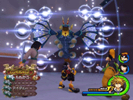
Clive ThompsonI was barely one hour into playing Kingdom Hearts II, gaming’s latest bona-fide hit, when I encountered the first “boss battle.” It was a three-story tall gray monstrosity — I barely came up to his knee. We lunged about, frantically trading blows, until I finally located his weak spot and plunged my “keyblade” in. Boom: He dissolved into black dust, leaving me with a sore thumb and a system full of adrenaline.
And the curious sense of satisfaction that comes from a boss battle. They’re among the most cherished tropes in gaming: Get a bunch of gamers together to talk about adventure games or action titles, and sure — everyone will praise the wonderful characters, the superb graphics, the intriguing narrative. But it’s the boss battles that leave scars on their souls. They wind up sounding like grizzled war veterans, reminiscing wild-eyed about facing The Flood in Halo, four-armed Goro in Mortal Kombat or even Bowser in Super Mario Bros. Bosses dominate the psychic landscape of games.
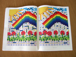
This is great: The artist Danielle Aubert uses Microsoft Excel as a way to create pictures. As she writes on her site:
Microsoft Excel is a program designed to track and compute information, but here I am using Excel as a drawing tool. These drawings are a part of a series of sixty drawings that I executed (more or less) every day for fifty-eight days. Each drawing is in a new ‘worksheet,’ which is automatically set up as a grid. These drawings were made by changing cell preferences for background color, fill pattern, and border styles and from time to time inserting ‘comment’ boxes and letters or words.
It reminds me alternatively of byzantine mosaic, early computer-graphic pixel-art, and paint-by-numbers. The latter is kind of the most intriguing concept of all: It’d be fun to see her release the drawings as a set of cells, each with a number in it corresponding to a color, like a classic paint-by-numbers. Then you just use the “fill in cell” command to plop the right color in each cell, and there’s your picture!
I’ve excerpted one of her more “realistic” pictures above, but she uses the technique to produce all manner of styles. Check her archive online here — I can’t link to individual creations, but a few of my favorites include March 16 (which looks like a sort of punchcard surrealism done in the Collision-Detection color scheme) and April 3, which looks like a concrete poem created on an Atari 2600.

This is wonderful: This airplane runs Linux as its onboard-display operating system, and as someone documented in a picture on Flickr, it crashed out. As Aaron Suggs noted:
I like how white this photo is … like something out of a Sci-Fi movie. Except for the flight attendant.
Actually, I think the flight attendant is a nice touch — straight outta 2001: A Space Odyssey! But seriously, I’m fascinated by the fact that the airlines base their display systems on Linux. Every time I fly somewhere and I use the seat-view entertainment system to play those godawful versions of Tetris and Poker (why in hell can’t they just run Flash and get some decent casual games?), I always feel a shudder of fear. “Yeah, apparently some guy tried to play Hangman in Row 34 and the system brought the whole plane down.”
Check out the threat on the Flickr page for endless speculation about precisely what that airplane system was doing when it went down.

I blogged a while back about “the seeing-eye tongue” — a technology that takes visual images and translates them into electrical impulses on a strip you place on your tongue. Since tongues are highly granular, they can sense incredibly minute gradations. People who use the system describe it like ESP — being able to “see” things you normally couldn’t. The technology was originally developed for the blind, but according to a recent story on MSNBC, the military and law-enforcement agencies are now experimenting with it:
Michael Zinszer, a veteran Navy diver and director of Florida State University’s Underwater Crime Scene Investigation School, took part in testing using the tongue to transmit an electronic compass and an electronic depth sensor while in a swimming pool.
He likened the feeling on his tongue to Pop Rocks candies. “You are feeling the outline of this image,” he said. “I was in the pool, they were directing me to a very small object and I was able to locate everything very easily.”
The military wants to route sonar through it and effectively give soldiers a 360-degree field of vision — “eyes in the back of your head”. Me, I’d love to see this used as a video-game interface! Imagine playing a game where you look at the action on screen, but also have a sixth-sense perception of events transpiring far away, or invisibly, on in another dimension.
Oh, and you’d look classy sitting there on your sofa, with a couple of electrodes sticking out of your mouth.
(Thanks to Frank for this one!)
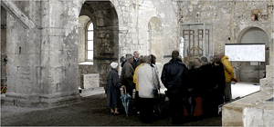
Three years ago, I blogged about a performance of John Cage’s “As Slow As Possible” — a piece of organ music that he intended to be played, uh, as slow as possible. The first-ever staging of the piece lasted 29 minutes. Now a group of Germans are taking it to a logical extreme: Their performance will last 639 years. Back in 2003, the only sound audible was the gentle wheeze of the organ’s bellows being inflated, a process that took 17 months.
But now the audible music is going, and the New York Times has a terrific piece about it today:
Like the imperceptible movement of a glacier, a chord change was planned for Friday. Two pipes were to be removed from the rudimentary organ (which is being built as the piece goes on, with pipes added and subtracted as needed), eliminating a pair of E’s. Cage devotees, musicians and the curious have trickled in to Halberstadt, a town about two and a half hours southwest of Berlin by train known as the birthplace of canned hot dogs and home to a collection of 18,000 stuffed birds.
“In these times, acceleration spoils everything,” said Heinz-Klaus Metzger, a prominent musicologist whose chance comments at an organ conference nine years ago sparked the project. “To begin a performance with the perspective of more than a half-millennium —it’s just a kind of negation of the lifestyle of today.”
Apparently they’re placing weights on the organ’s keys to keep the notes sounding, and they’ve rigged a solar-panel array to the organ’s power supply so that an electrical outage won’t stop the performance. This latter fact, is, of course, what’s so “Clock of the Long Now” about this performance: When you plan a project that’s going to last for 639 years, you have to really think ahead.
By my calculations, assuming my progeny continue to have progeny, my 60th great-grandchild will be around to hear the song end.

Ever heard of “ringxiety”? It’s a neologism for a phenomonen that, according to last week’s Styles section in the New York Times, is occurring more and more: A nagging sense that you can hear your mobile phone ringing when it actually isn’t.
This happens to me all the time! Often when I’m running the water in the sink in my bathroom, I’ll be convinced I can hear my mobile ringing. I rush out into the living room and — nothing. Other sounds that trigger it for me include the ride cymbal in songs from Sheryl Crow’s self-titled album, and certain traffic noises from 6th Ave. outside my window.
As it turns out, there’s some interesting science behind ringxiety, as the Times reports:
The ear gives unequal weights to certain frequencies, making it particularly sensitive to sounds in the range of 1,000 to 6,000 hertz, scientists say. Babies cry in this range, for example, and the familiar “brrring, brrring” ringtone hits this sweet spot, too. (Simple ringtones are more likely to produce phantom rings than popular music used as a ringtone.) [snip]
“It’s a 1,000 hertz tone that can be generated by just about anything,” Mr. Jenkins said. And because most sounds are the result of two or more tones put together — human speech is multitonal, for example — simple tones really stand out.
What’s more, tones generated around 1,000 hertz are also really hard to spatially locate. Humans locate sounds based on their frequency: We pinpoint high-pitched sounds based on their volume level, and low frequency sounds based on their arrival time in our ears. But 1,000-hertz noises fall into an acoustic blind spot in this system, which means “a noise in that range seems just as likely to be coming from the television to the right as a purse sitting to the left.”
I’ve become so addled by these auditory quirks that if I’m particularly anxious or stressed out, I sometimes find myself literally hallucinating mobile-phone sounds when I lie in bed. Surrounded by relative silence, I’ll imagine that I’m hearing the “arriving text-message alert” sound, which in my case is a quiet, burbling techno sequence that ends with a few filtered noises precisely in that 1,000-hertz range. I’d like to think that I’m being hoaxed by a trick sound, but honestly I think that in this situation, the sounds are completely inside my head: A form of madness unique to the digital era.

Attention, passengers! A few days ago, commuters on Toronto’s GO train looked up at the onboard pixellated advertising signs and saw the message: “Stephen Harper eats babies”. Stephen Harper is, of course, Canada’s new conservative prime minister, and as a friend of Harper’s who saw the scrolling message told CTV …
“… I worked with Stephen Harper for five years and never once did he, in that time, eat a baby.”
Heh. Obviously, as the story points out, the sign had been hacked. And while the reporter doesn’t make it clear how the trick was accomplished, I think I can guess how it was done. A few years back, 2600 magazine published an article all about hacking pixelboard signs, and apparently the vast majority of these signs are programmed using an infrared keyboard. The keyboard is fairly standardized, and while the signs can be protected with a password, virtually none of the gormless businesspeople who use the signs ever bother to change the password from its factory-installed default — which is usually something like “password” or “admin” or “1234” or whatever.
It kind of makes me want to go buy an infrared keyboard and see what signs around Manhattan I can alter!
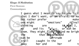
A while back I blogged about a cool literary project: A Flash site that delivers the chapter “e” from Christian Bok’s book of experimental poetry, Eunoia. It turns out that the guy who designed the Flash app — Brian Kim Stefans — is both a superb designer and poet himself, and he’s just released another, even cooler art project called Kluge: A Meditation and other works. It’s a collection of interactive poems — bits of shifting text and sound that feel like an intersection of poetry, magic realism and the aesthetics of online advertising.
In “They Said I Was Lonely”, the cursor works like a peephole: You have to move it around the screen to slowly reveal a creepy little stanza and background image. In “A Car Drives to Rome”, the cursor reveals words missing from a dadaist string of proclamations (“A practise has nurses, a beer drowns a fish”), while an Italian voice chirps “Grazie”.
There’s also a series of hilarious “One Letter at a Time” pieces, in which the screen displays the entire text of famous works of art — from Ginsberg’s “Howl” to the script of Star Wars — one letter at a time, accompanied by old-school typewriter clatter. (It’s a cheeky meditation on the idea that while the audience experiences the work as a total whole, the author has to hack through it in dribs and drabs.) My personal favorite of Stefans’ work is the title piece, “Kluge”, in which the cursor slowly erodes the text as you wave it around the page. (That’s a screenshot of it above.)
Stefans describes his technique as …
… the uses of digital technology to expand the techniques that poets use — whether this be in multimedia, interactivity, algorithmic processes, and digital typefaces.
For years, people — particularly in the video-game world — have been heralding the eventual arrival of “interactive narrative”, stories that harness the fluidity of digital media. But the fact is that interactive narrative is an oxymoron. It’s like talking about “dry water”. The audience’s lack of control over a story is the crucial part of what makes narrative narrative. The fun of a good tale is masochistic, submitting yourself to the will of the storyteller; it’s sitting there and going “yeah? And then what happened? And then?” That’s why the best narrative video games (such as the Metal Gear Solid series) are ultimately pretty uninteractive: You can choose from a couple of possible endings, sure, but the basic thrust of the story is set in stone. That’s what makes them good stories.
But here’s the thing: While interactive narrative may be a nonstarter, interactive poetry works admirably well. Think about lyric poetry for a second: The dense reliance on metaphor and imagery; the use of white space as a constituent element. This stuff all lends itself incredibly well to kinetic, plastic, interactive displays, which is precisely why really good online ads already feel like dynamic poems. (You could say the same thing about half of today’s best TV commercials or music videos.) Once you’re dealing with a lyric medium — and most of modern poetry is indeed lyric — interactivity seems to make sense.
(Thanks to Grand Text Auto for this one )
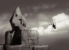
Behold the city of Galvez: An imaginary urb created by Oscar Guzmán, who did some trippy Photoshopping on sixteen real-life photographs. As he describes it:
Despite having characteristics of a photographic record, the images of Galvez don’t have and never have had a counterpart in the physical world.
The photographic document is a record that remits us to a point in space and time, that is, it’s an index. Therefore, the index of Galvez remits us to the reality of imagination. In this way, Galvez acquires its right to be considered a document of Reality, making it evident the impossibility to create frontiers between the real and the imaginary.
A little mangled, but you get the idea. It reminds me of the visual aesthetic of Riven — a video game that consisted of nothing but static pictures of a world, created via CGI and photomanipulations. I actually wish there were more art projects like this, or at least more games like Riven, because the have a Dali-esque dreamlike quality that really spooks me, in a good way. Indeed, the stationary nature of the images in Riven were a chief part of the game’s allure: They invited you to study each scene closely, in a way that few modern games ever do. Even the most articulated 3D games never quite encourage this scrutiny, because you’re too busy roaming around to sit still for long enough to drink in a scene. In Riven — or with Galvez — the fun is in staring closely at each vista and drinking in the weirdness.
That’s what made the occasional animations in Riven — and in Galvez — so startling: It felt like a picture that had suddenly come to life. I remember when I was walking through the forest in Riven, then turned around and saw a little girl staring at me, who abruptly fled. I nearly jumped out of my skin.
(Thanks to Erik Weissengruber for this one!)

Few things are more flexible than the noodly octopus arm; it has a nearly infinite number of degrees of freedom. But when it comes time to eat? Apparently octopi pull a neat trick — they initiate muscular contractions that create temporary “joints” that limit their arms’ range of movement, so that they move oddly like … human arms.
The scientists reported their findings in the recent issue of Current Biology, and a report on MSNBC describes it thusly:
Researchers recorded muscle activity in octopus limbs, and found that an arm generates two waves of muscle contractions that propagate toward each other. When the waves collide, they form a part-time joint.
This process occurs three times, forming a shoulder where the arm meets the body, a wrist where the suckers have grasped their food, and an “elbow” somewhere in between. The elbow typically exhibits the most movement during food retrieval.
The researchers say this is a remarkably simple and apparently optimal mechanism for adjusting the length of arm segments according to where the food item is grasped along the arm.
(Thanks to Yishay Mor for this one!)
I'm Clive Thompson, the author of Smarter Than You Think: How Technology is Changing Our Minds for the Better (Penguin Press). You can order the book now at Amazon, Barnes and Noble, Powells, Indiebound, or through your local bookstore! I'm also a contributing writer for the New York Times Magazine and a columnist for Wired magazine. Email is here or ping me via the antiquated form of AOL IM (pomeranian99).
ECHO
Erik Weissengruber
Vespaboy
Terri Senft
Tom Igoe
El Rey Del Art
Morgan Noel
Maura Johnston
Cori Eckert
Heather Gold
Andrew Hearst
Chris Allbritton
Bret Dawson
Michele Tepper
Sharyn November
Gail Jaitin
Barnaby Marshall
Frankly, I'd Rather Not
The Shifted Librarian
Ryan Bigge
Nick Denton
Howard Sherman's Nuggets
Serial Deviant
Ellen McDermott
Jeff Liu
Marc Kelsey
Chris Shieh
Iron Monkey
Diversions
Rob Toole
Donut Rock City
Ross Judson
Idle Words
J-Walk Blog
The Antic Muse
Tribblescape
Little Things
Jeff Heer
Abstract Dynamics
Snark Market
Plastic Bag
Sensory Impact
Incoming Signals
MemeFirst
MemoryCard
Majikthise
Ludonauts
Boing Boing
Slashdot
Atrios
Smart Mobs
Plastic
Ludology.org
The Feature
Gizmodo
game girl
Mindjack
Techdirt Wireless News
Corante Gaming blog
Corante Social Software blog
ECHO
SciTech Daily
Arts and Letters Daily
Textually.org
BlogPulse
Robots.net
Alan Reiter's Wireless Data Weblog
Brad DeLong
Viral Marketing Blog
Gameblogs
Slashdot Games
